
The Problem: Bridging the Tech Gap
Small and medium-sized e-commerce businesses often lack the resources to compete with larger retailers offering immersive shopping experiences like virtual try-ons. This creates a significant disadvantage in customer engagement and conversion.
The challenge was to design a brand and a user interface for BEDiZEN, a conceptual startup whose mission is to make Web Augmented Reality (WebAR) accessible, affordable, and easy to implement for these smaller businesses.
My Process: Building a Brand from Scratch
1 — Identity & Visual Strategy
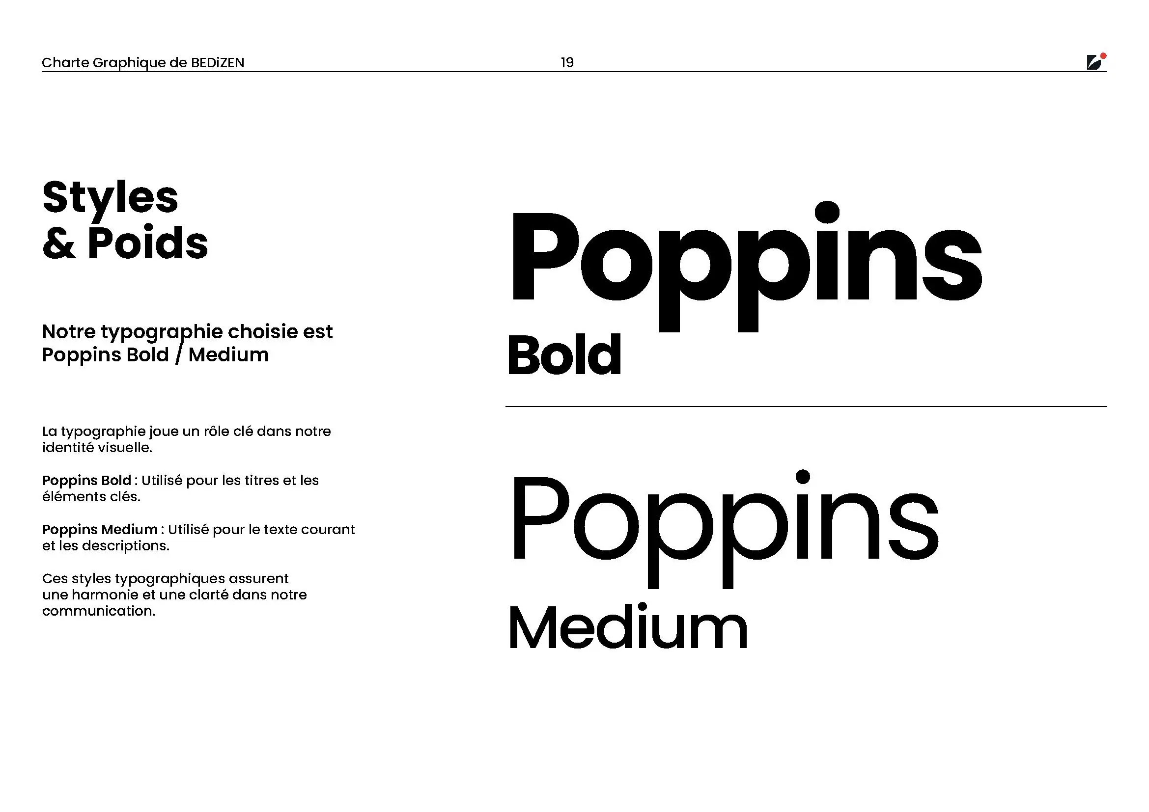
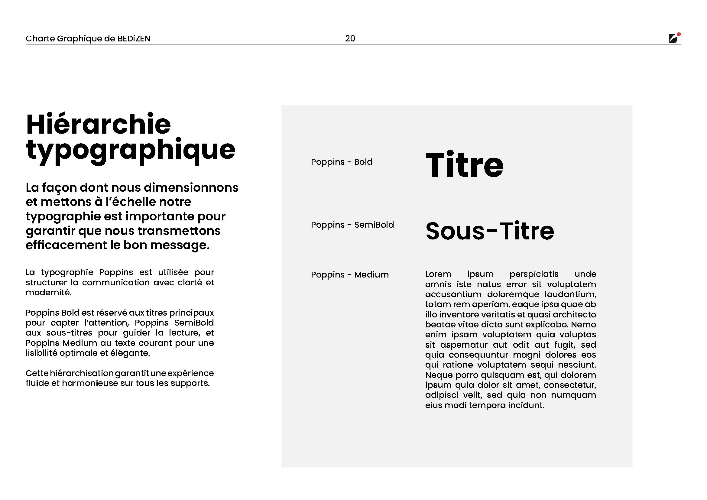
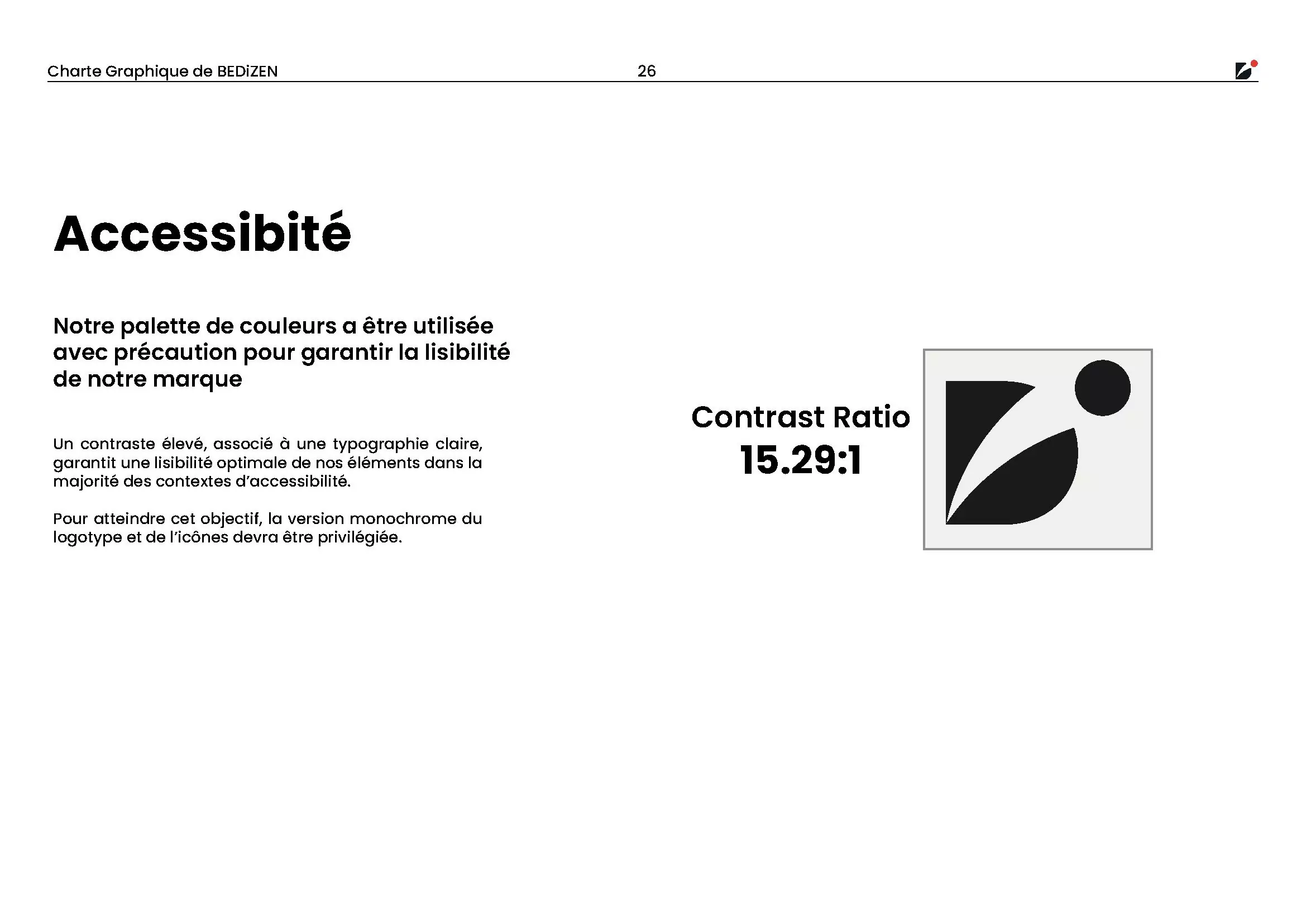
The goal was to create a brand that felt both technologically advanced and human-centered. Create a legible and accessible identity for the general public, not pretty, but functional. So this process included:
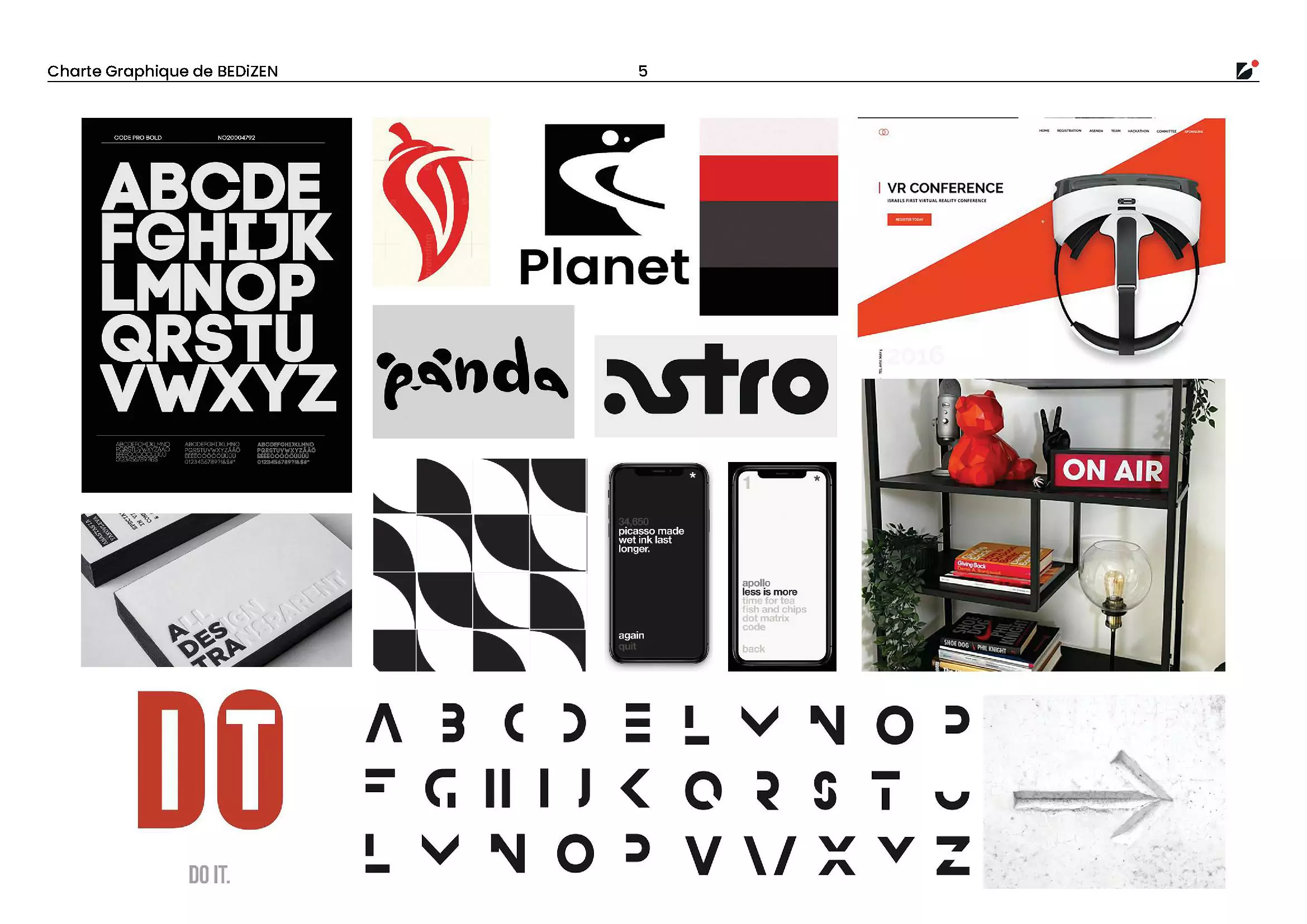
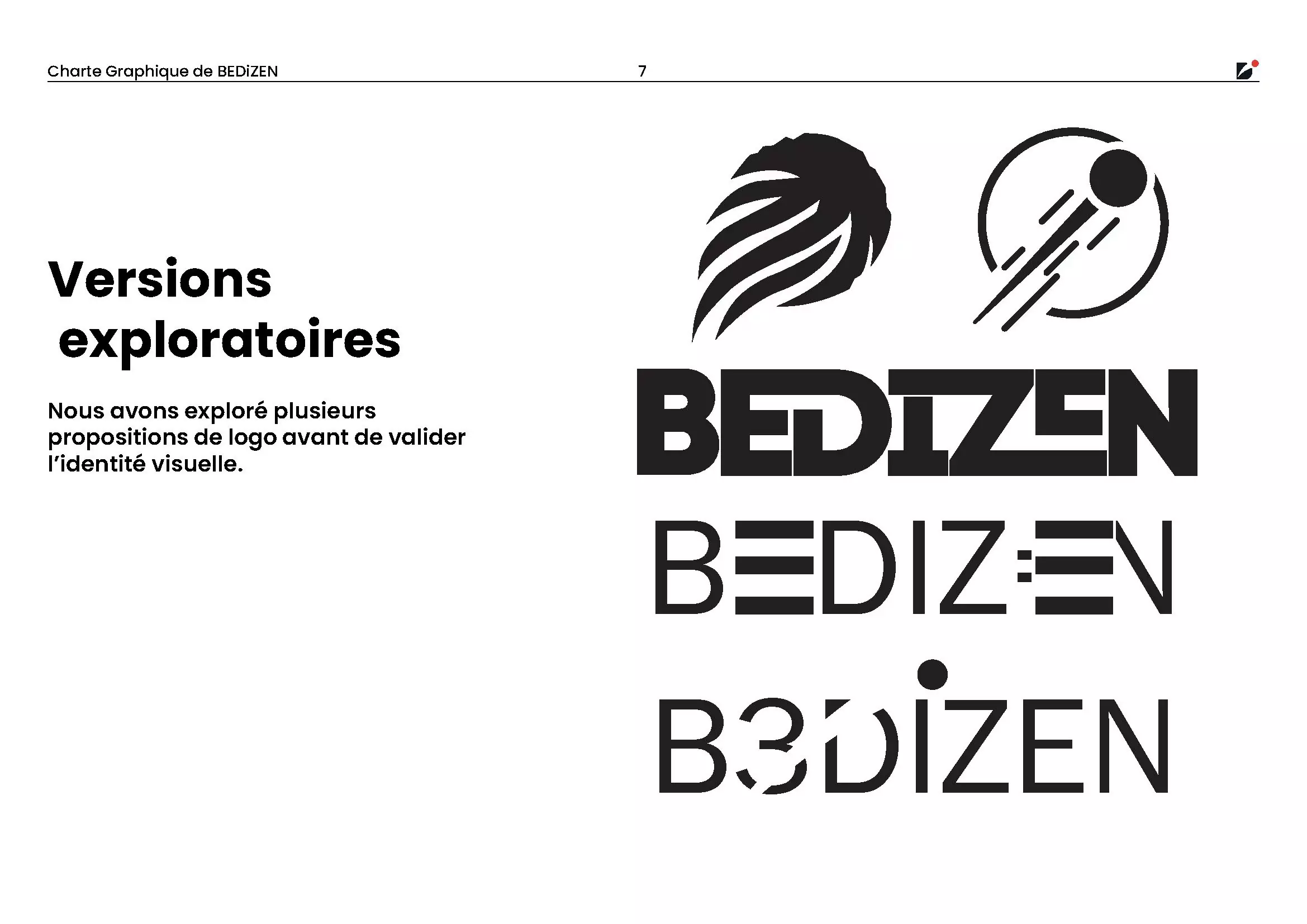
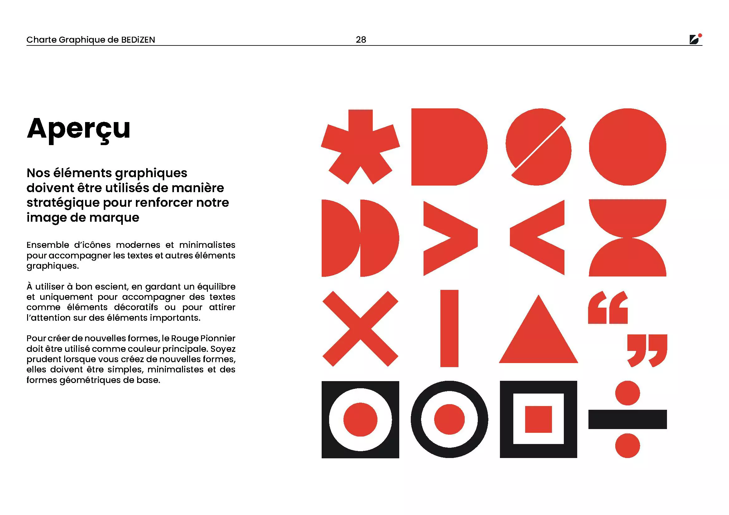
- Market Research: Analyzed how existing AR services communicate innovation to identify a unique position for BEDiZEN: modern, minimal, and focused on the experience.
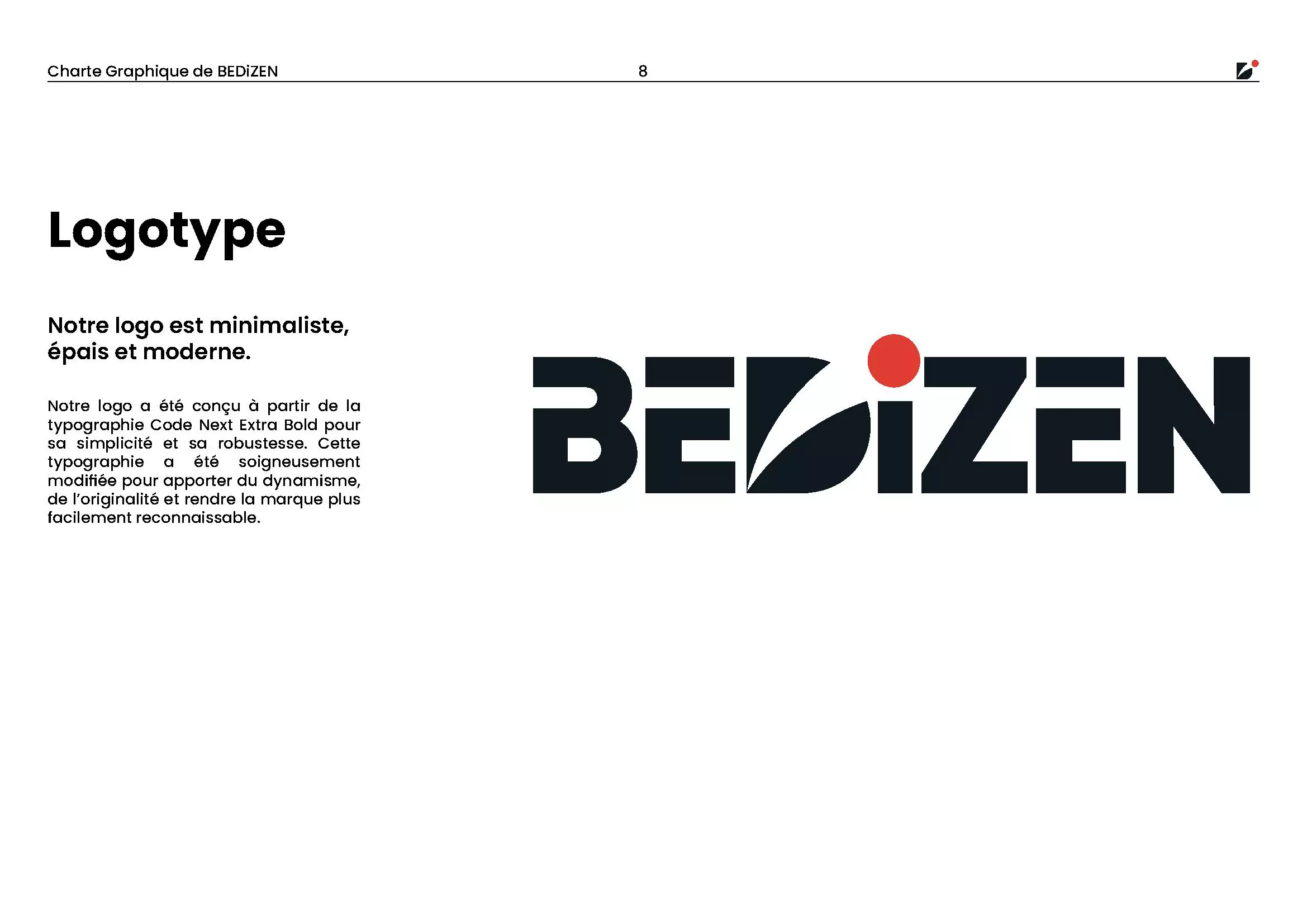
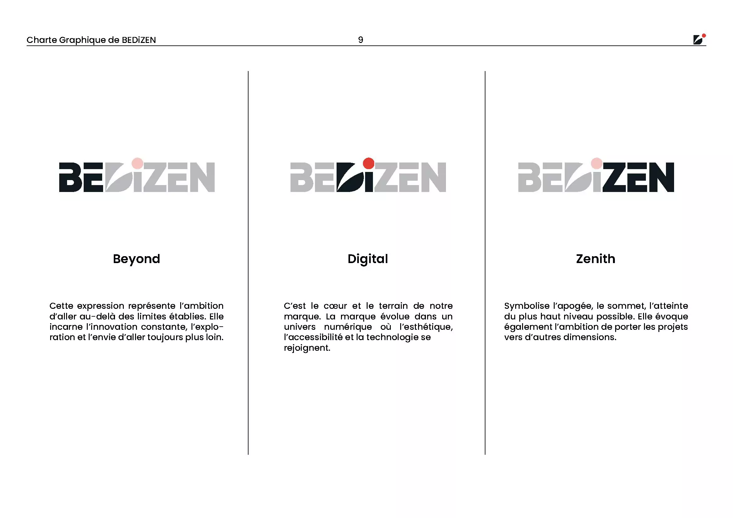
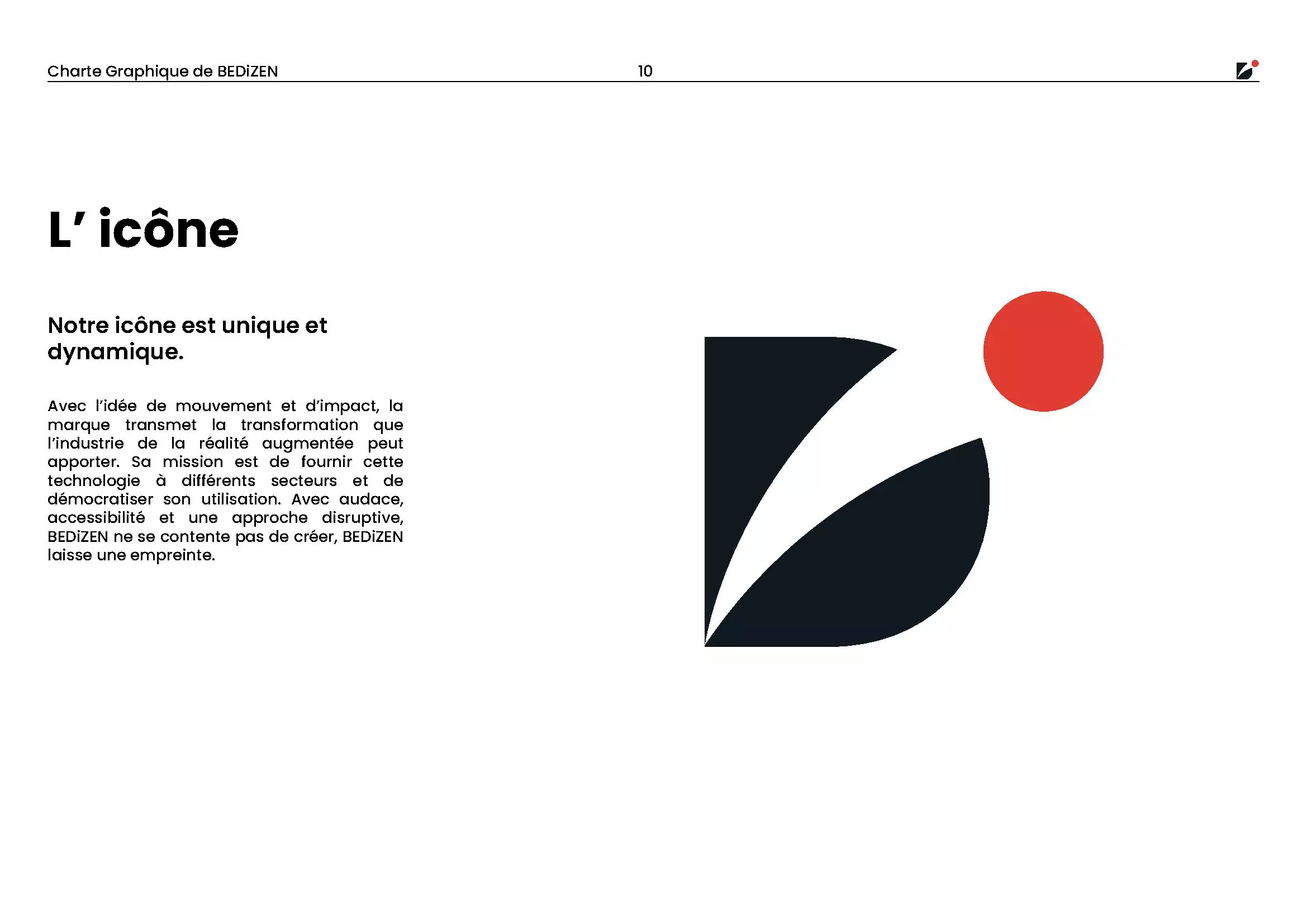
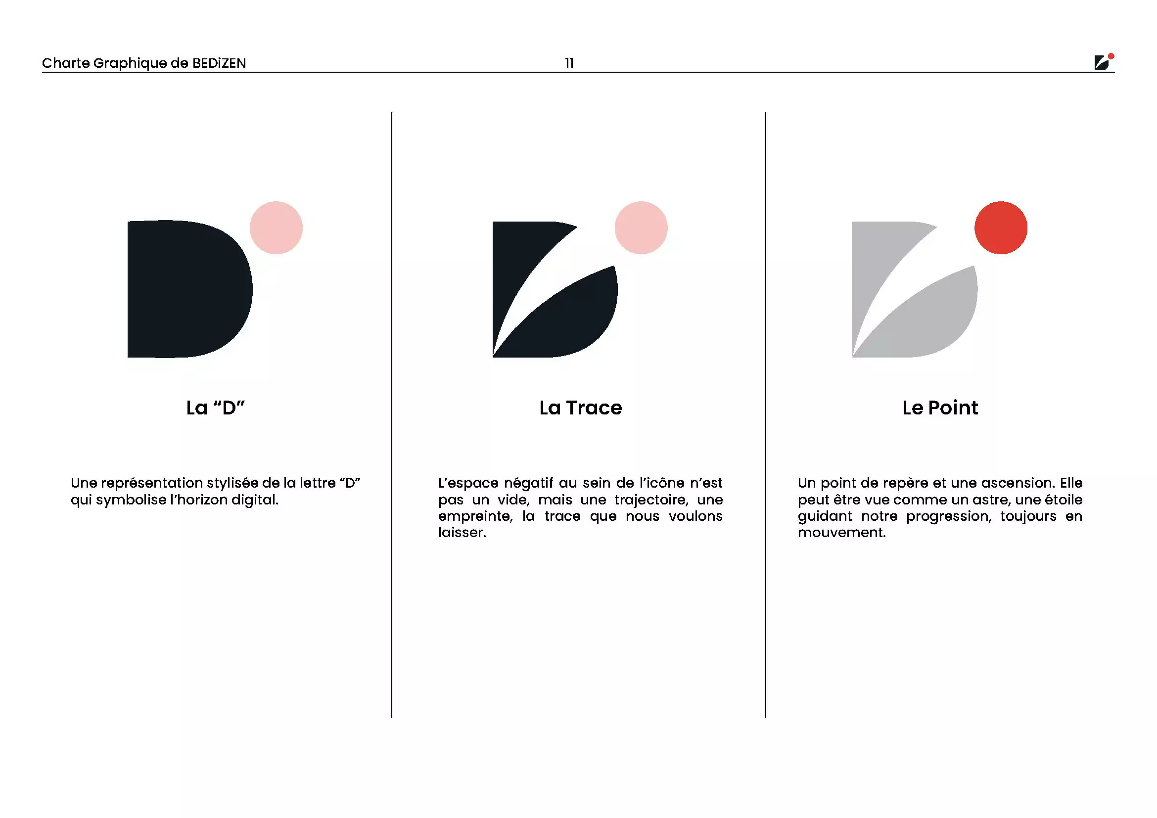
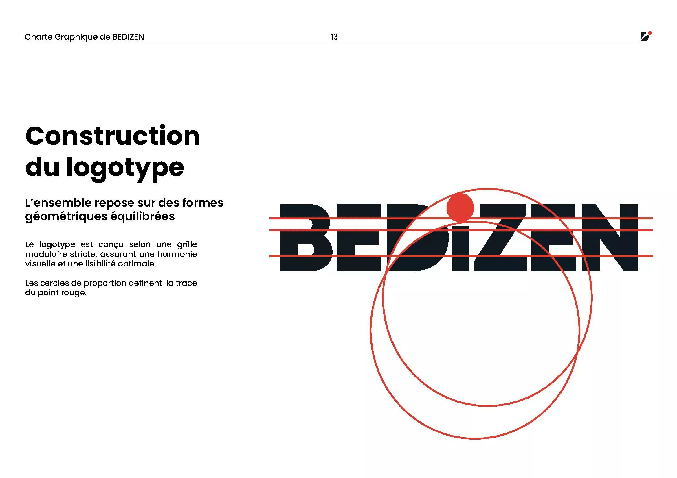
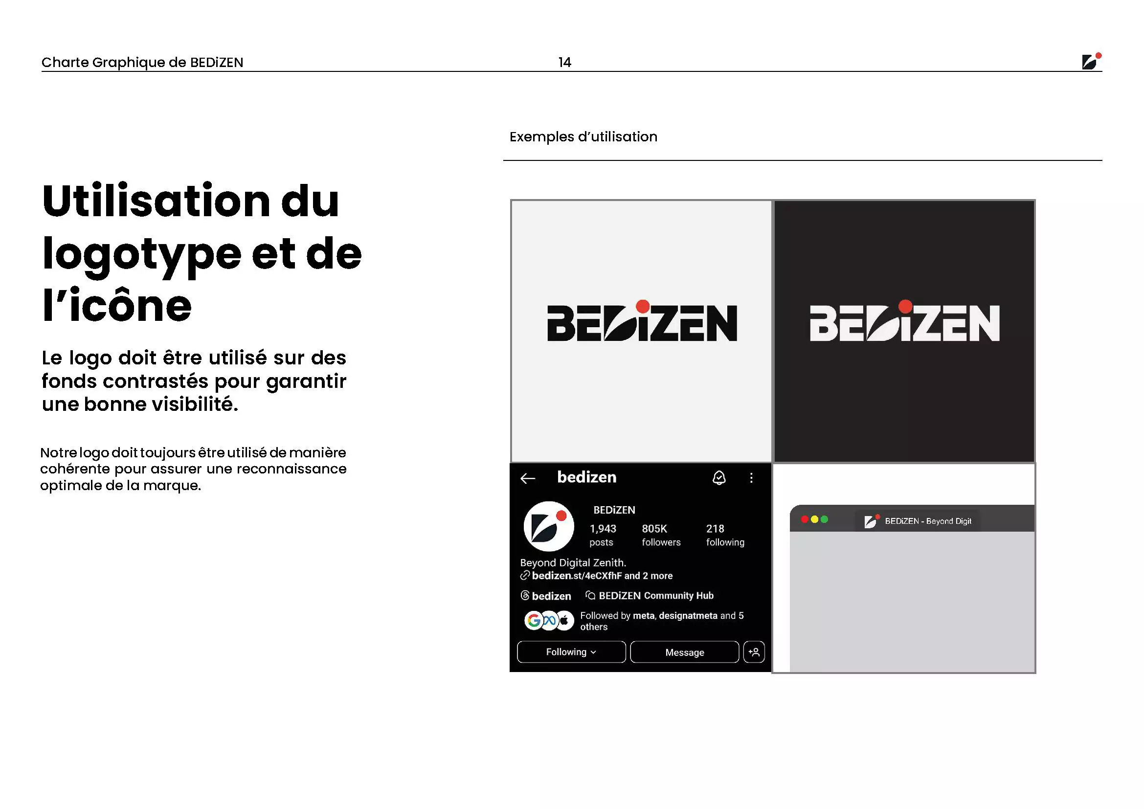
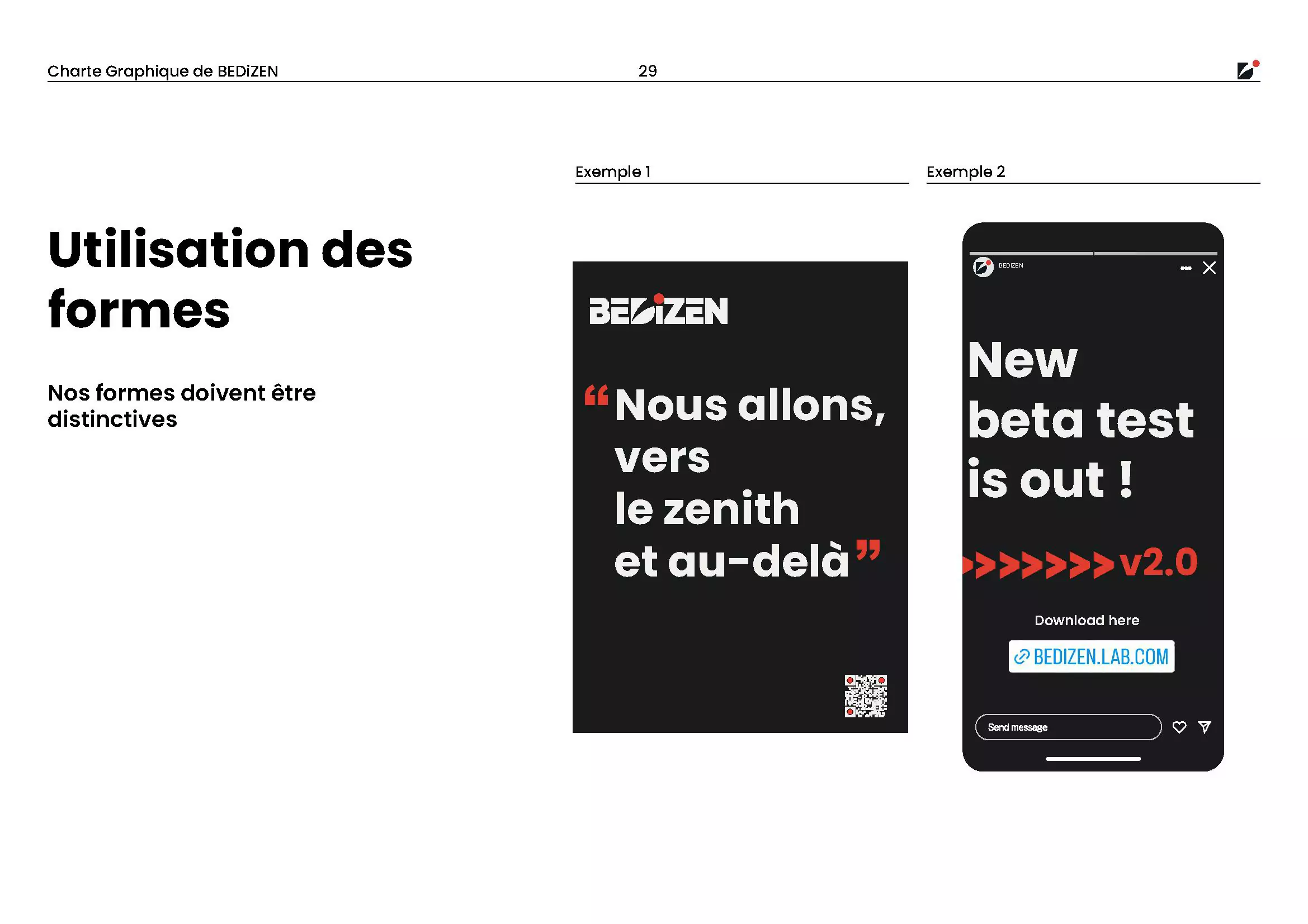
- Logo Design: The logo, built from a customized geometric font, conveys stability and movement. The red dot on the "i" acts as a spark of creativity.
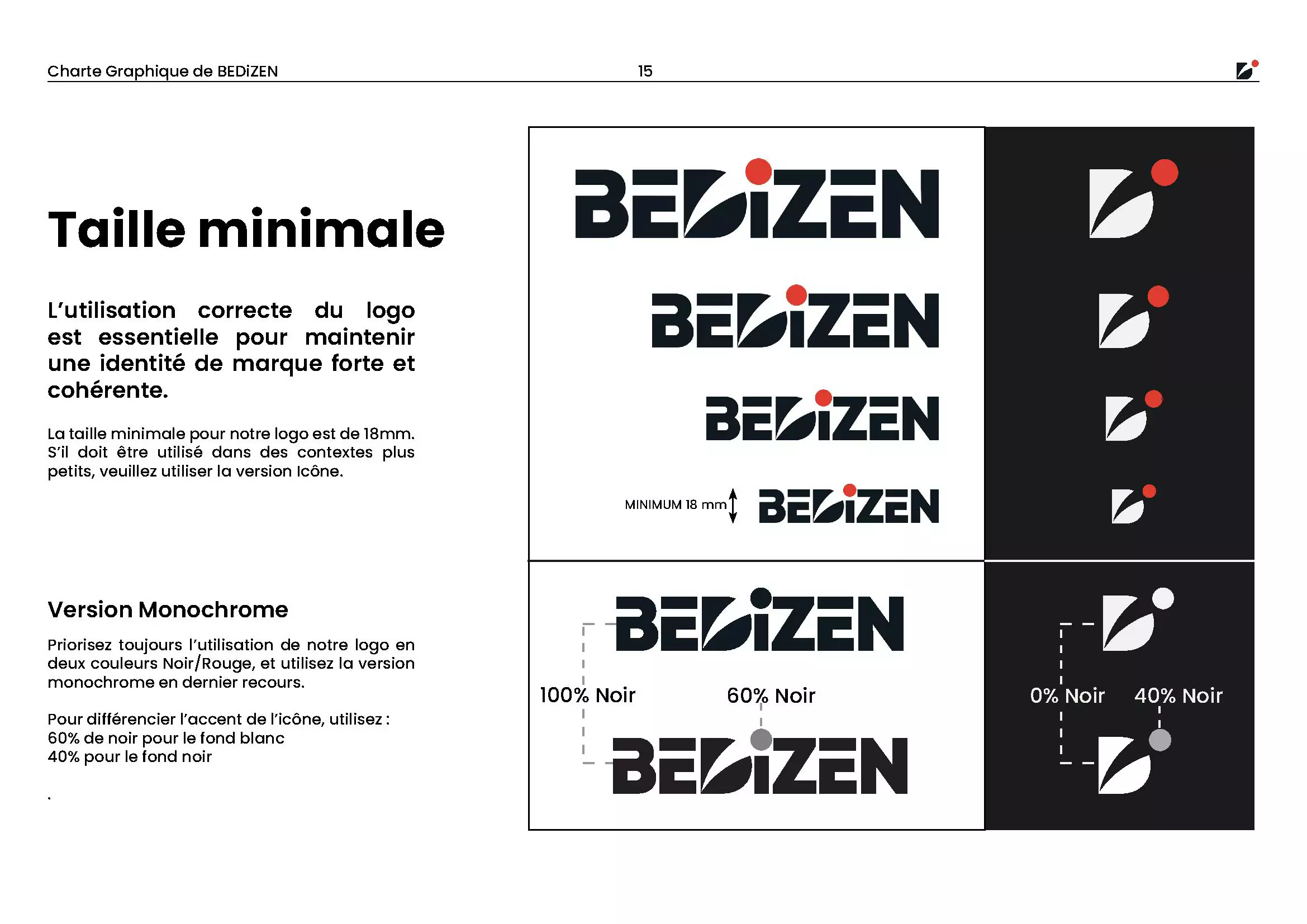
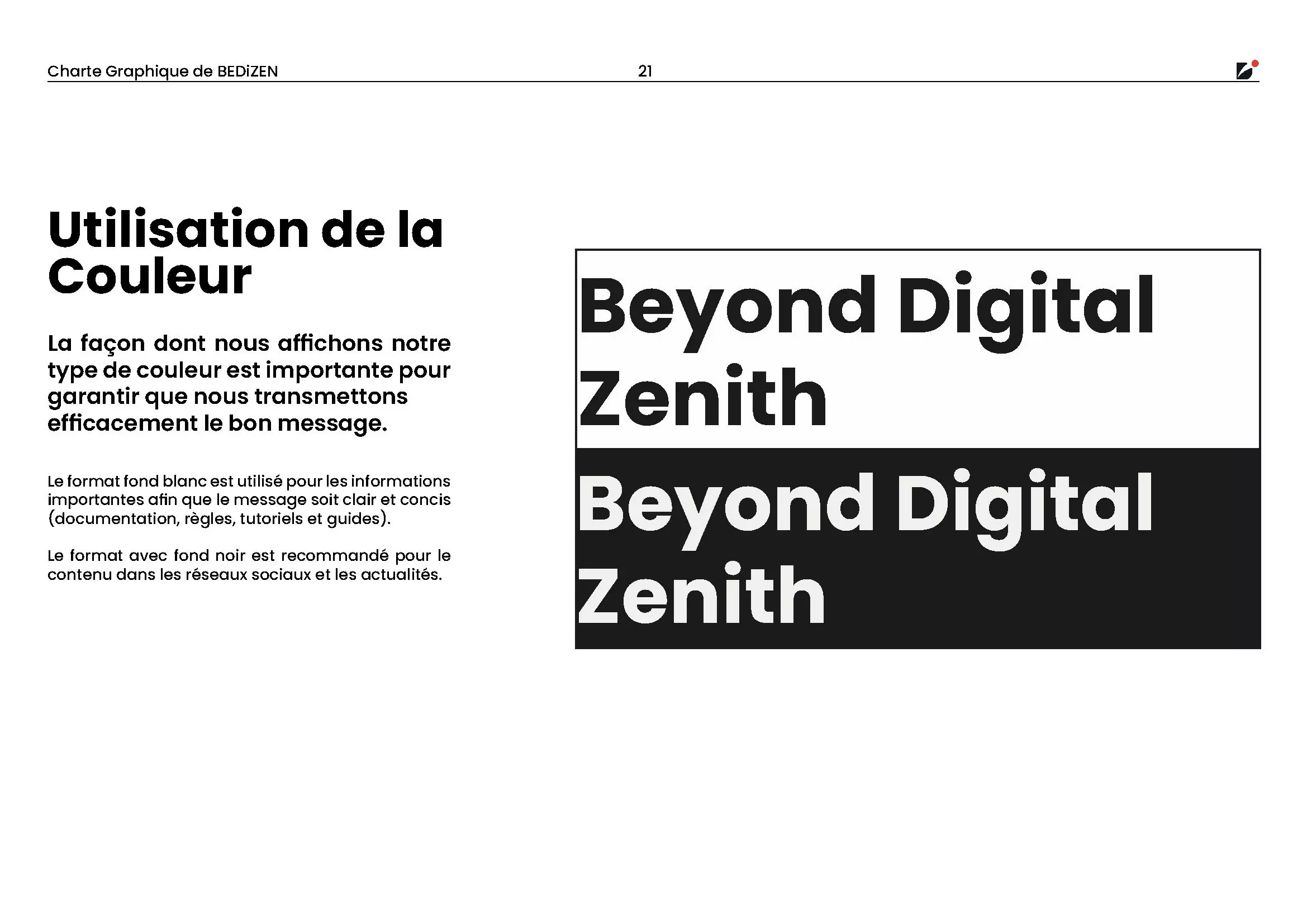
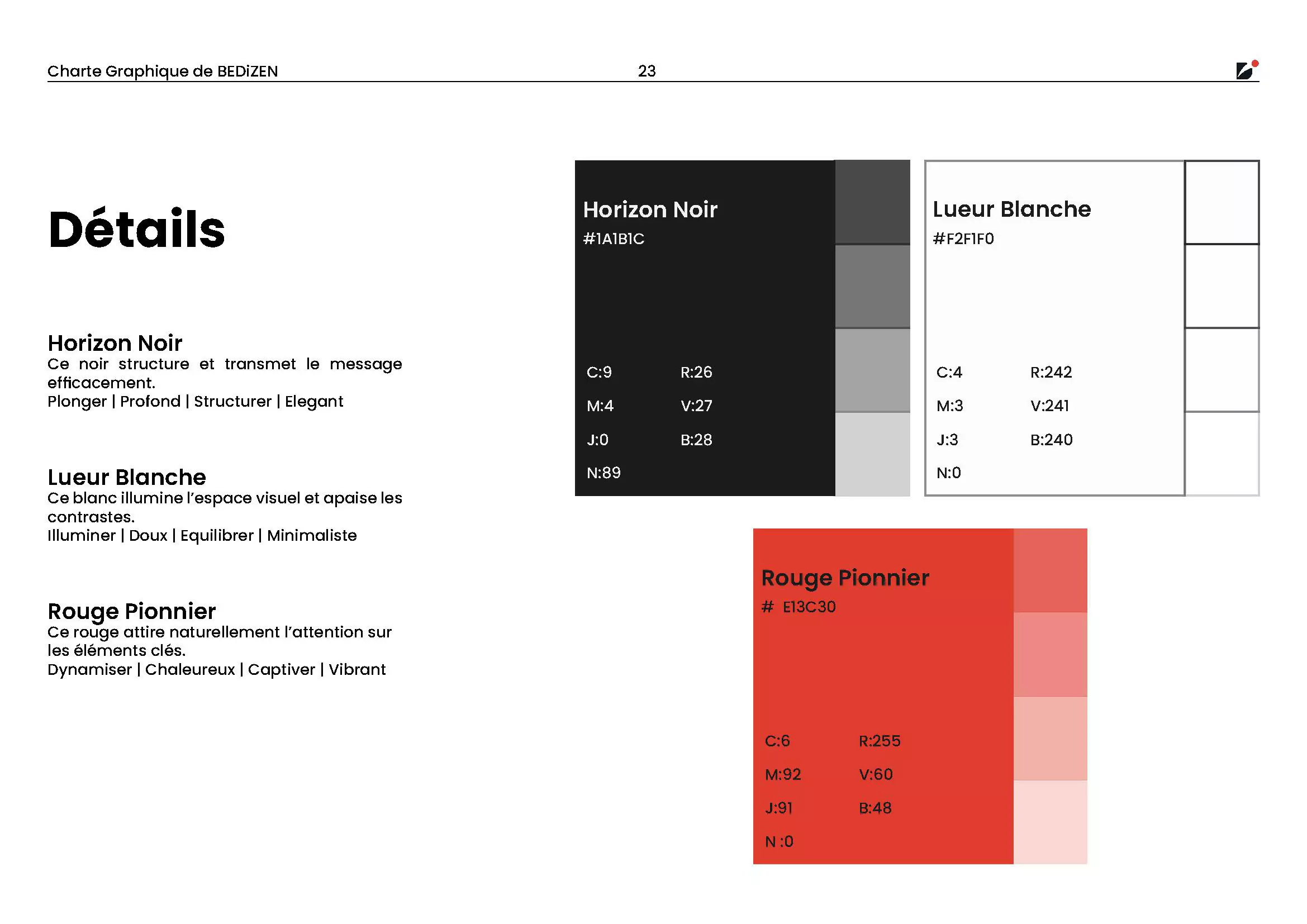
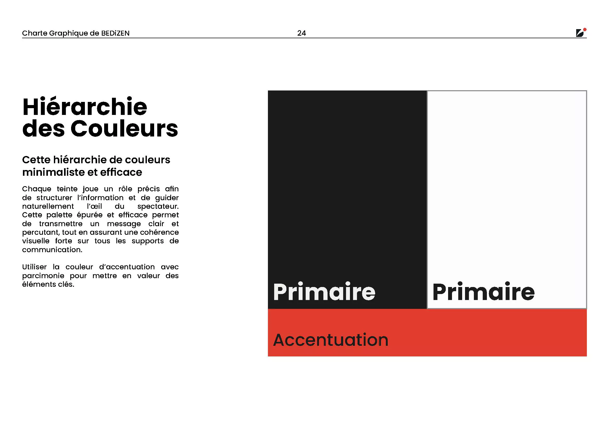
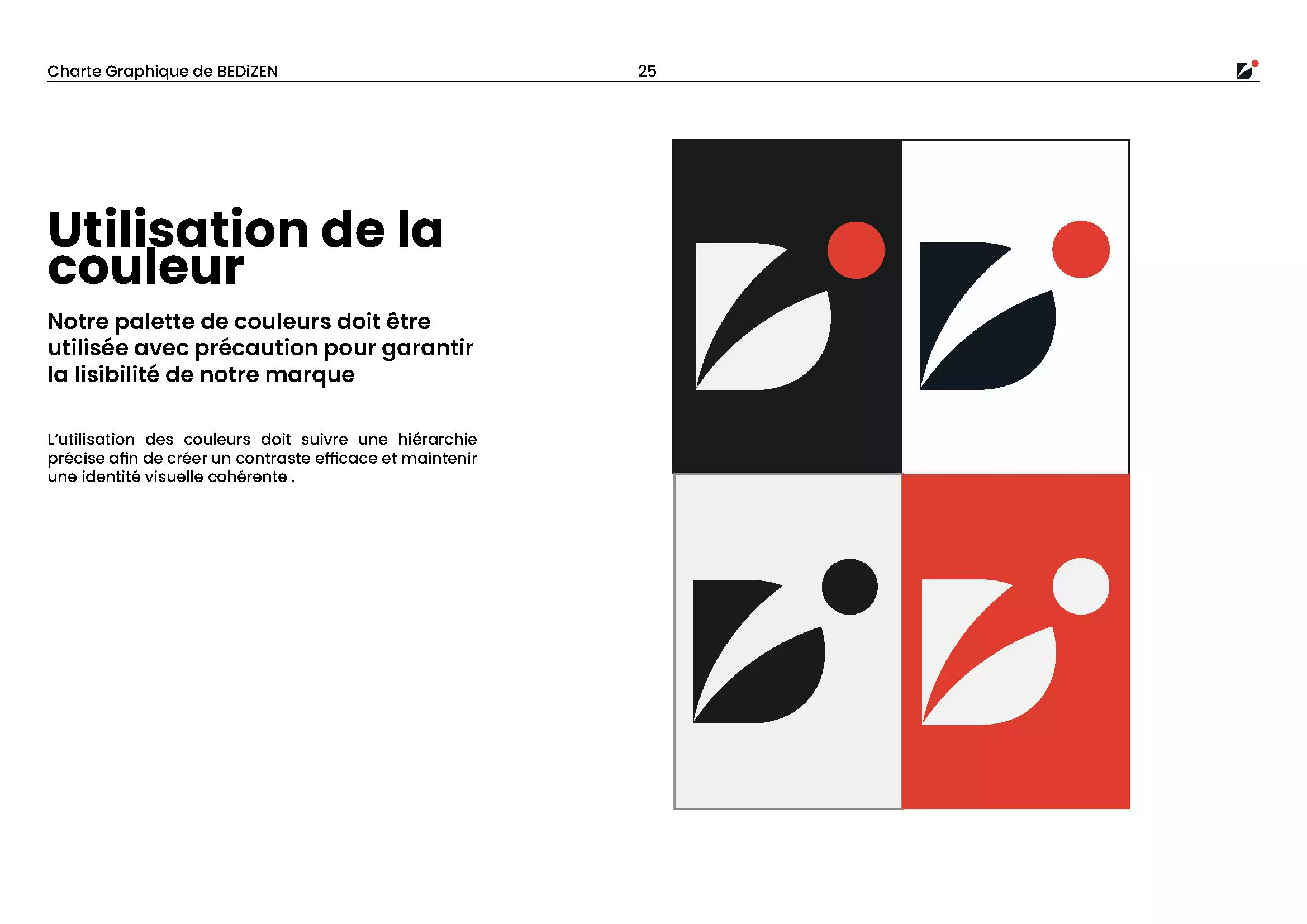
- Color Palette: A palette of dark gray, white, and accent red creates a feeling of elegance and energy, ensuring high contrast and accessibility.
2 — UI Prototyping & User Flow
Using Figma, I designed the Zoning, Low-fi Wireframes, and later a functional prototype focused on clarity. The user flow was structured to guide potential clients through BEDiZEN’s core services (WebAR, 3D modeling) and lead them to a clear call to action, demystifying the technology along the way.
A first version of this prototype was developed into a simple static website to showcase the brand in a real web context. Feel free to check it out (responsive version coming soon):
Version 1.0: The MVP
Initial Concept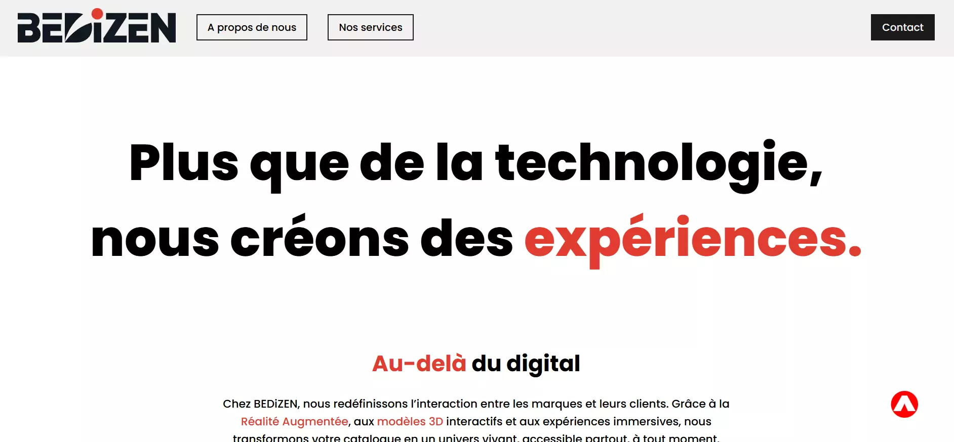
Design Decisions:
The initial focus was purely on "Clean Aesthetics." I prioritized large whitespace and minimal navigation.
Usability Issues Found:
- Users struggled to identify clickable buttons.
- Difficulty understanding current location within the site.
Version 2.0: Enhanced UX
Version in Progress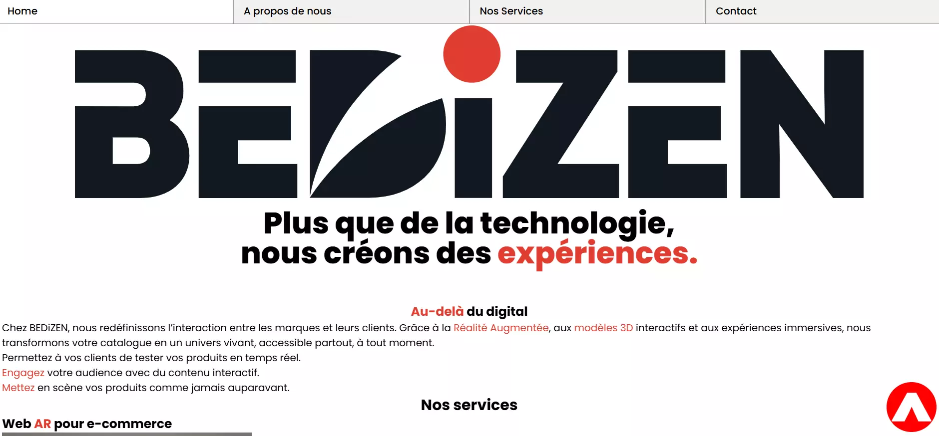
The Updates:
Based on testing feedback, I implemented a clearer navigation system and rebuilt the UI using Tailwind CSS to ensure a modern, scalable architecture.
Why this works better:
- Responsiveness: Tailwind's utility-first approach ensures a seamless experience across all device sizes (Mobile-First).
- Clarity: The new active states make it easy for users to identify their current location.
Impact & Key Takeaways
- Clear Value Proposition: The final brand identity successfully communicates BEDiZEN’s mission to be an innovative yet accessible partner for small businesses.
- Intuitive User Experience: The UI prototype focuses on a frictionless journey for non-technical users, making a complex service feel understandable and approachable.
- Key Learning: This project was a deep dive into building a brand from the ground up. The main takeaway was the importance of translating a complex technological vision into a simple, coherent, and compelling visual story.
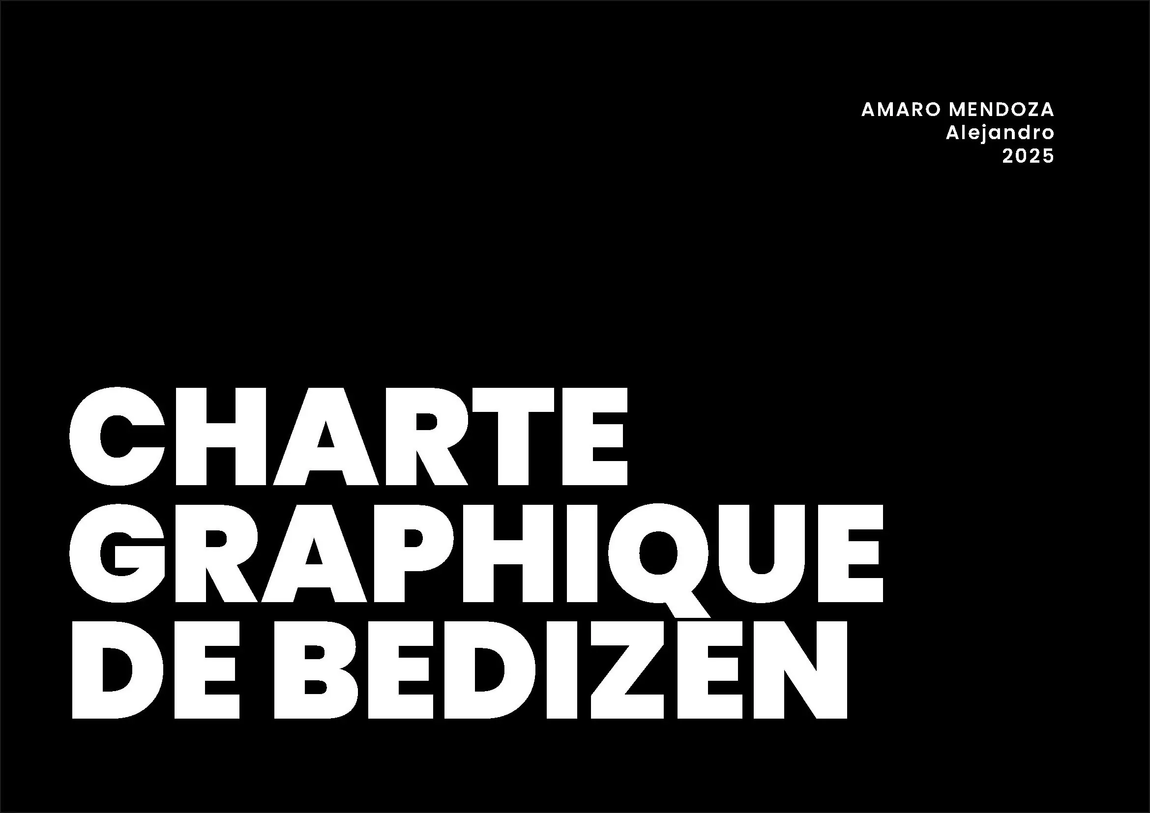
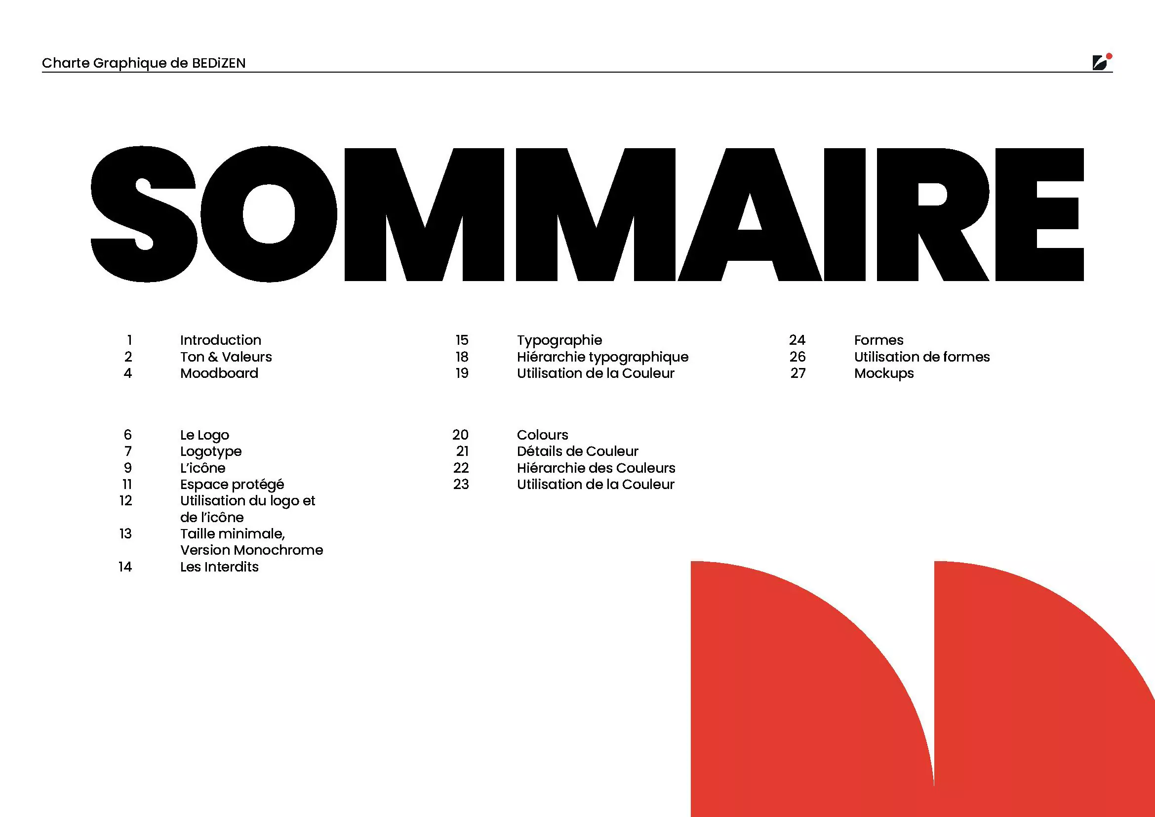
Project Documentation
The following document presents the complete style and brand guidelines developed from the ground up for BEDiZEN
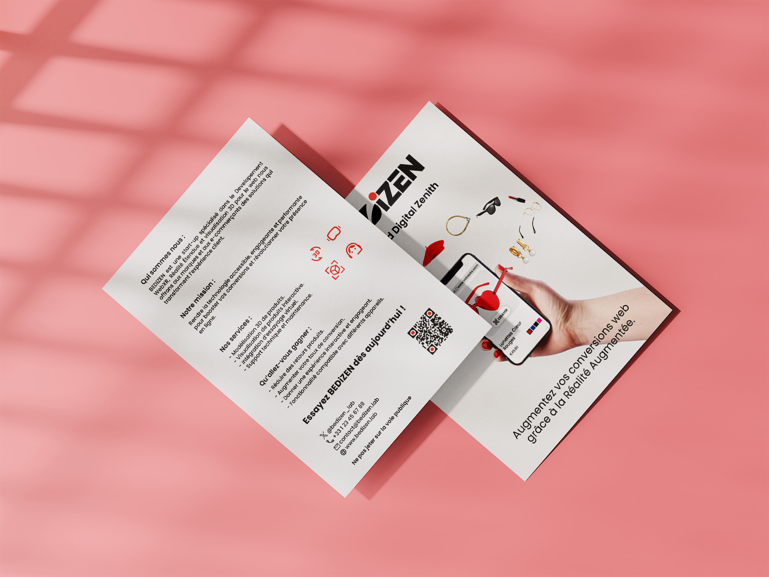
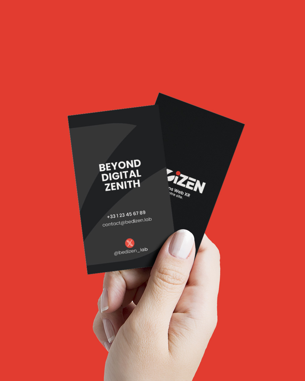
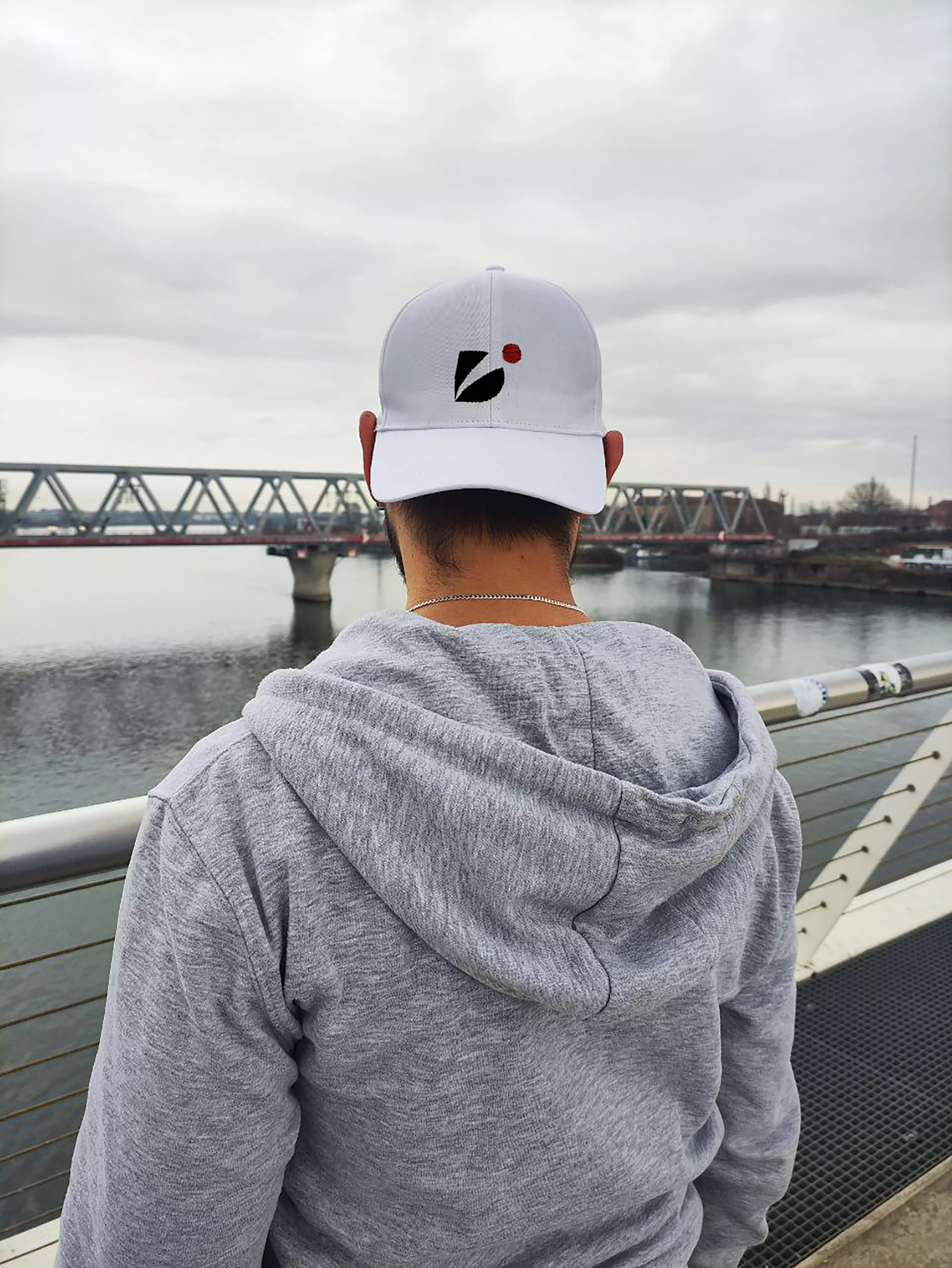
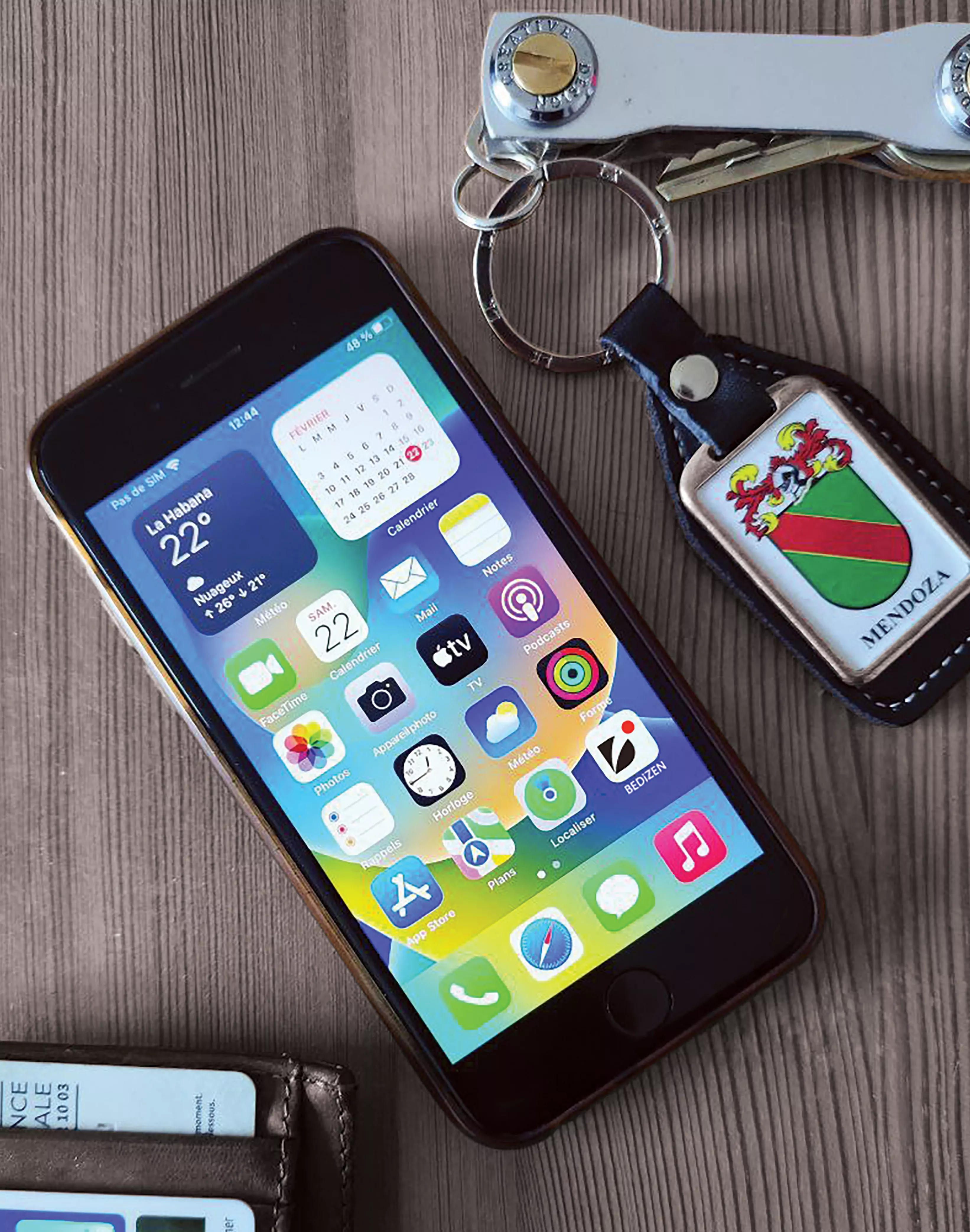
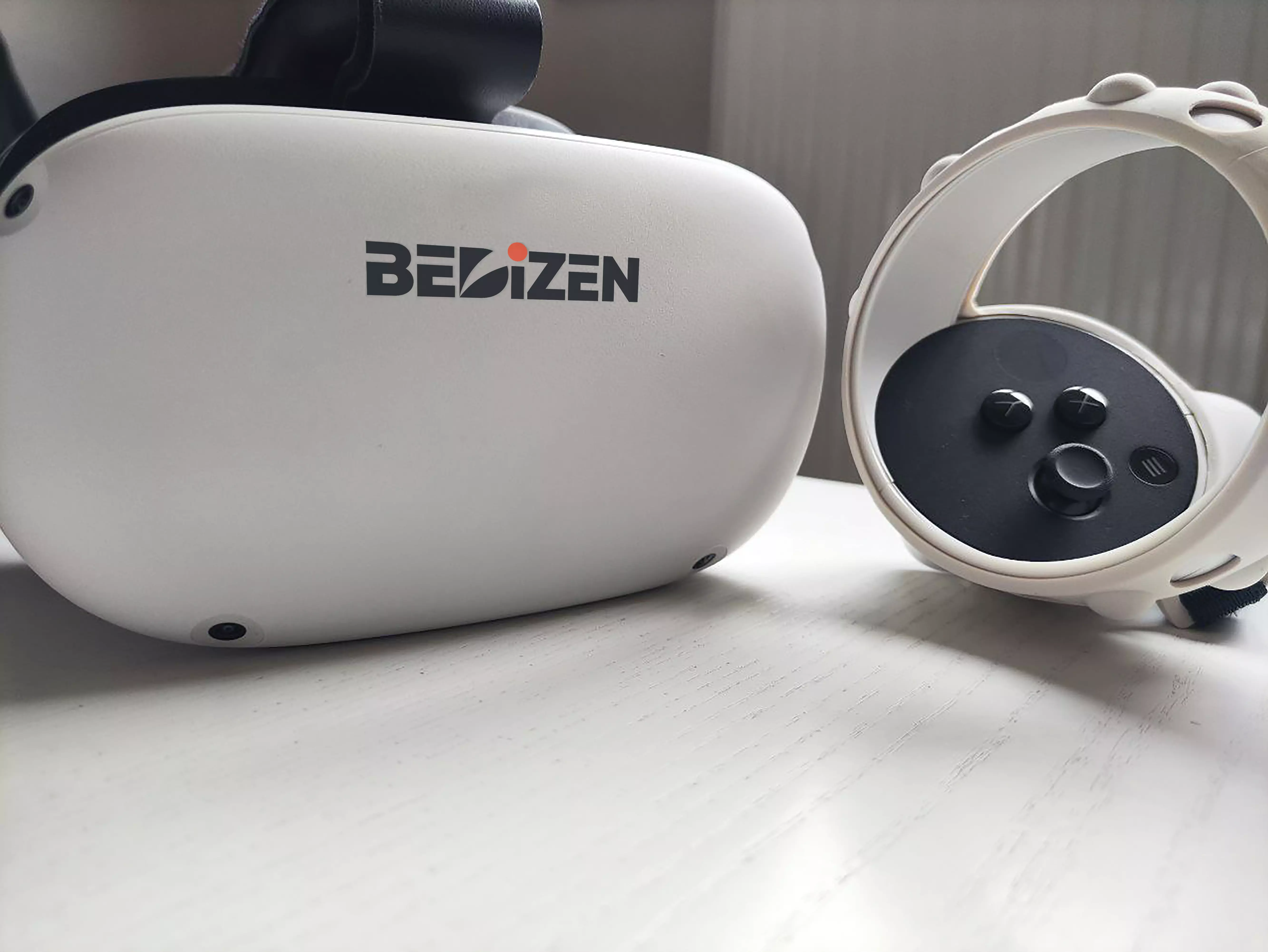
Project Gallery
A selection of mockups showing the BEDiZEN brand in different real-world contexts.
To Be Continued...
BEDiZEN is still growing as long my formation continue. The upcoming phase will bring the integration with Wordpress, the back-end development and maybe a prototype, o merge design, technology, and human experience — beyond digital zenith.