Festival de Cinéma du Monde
The Brief
Cinéville runs an annual festival celebrating independent and international cinema. The brief asked for a poster that felt eclectic yet accessible, chic but relaxed, welcoming to spectators "from every horizon." The one hard constraint: build the whole concept on the visual language of Surrealism, 1920s–1930s.
The Mission
Create a poster that captures the festival's unique spirit using the cultural and visual references of Surrealism. A festival poster usually sells a schedule. This one had to sell a feeling: the exact moment the lights go down and a room full of strangers quietly agrees to believe in something impossible for two hours.
My job was to translate a hundred-year-old art movement into a poster that still reads as a contemporary festival, not a museum reprint.
The Codes of Surrealism
Before designing anything, I anchored the brief in the actual visual vocabulary of the movement:
- Dreamlike imagery: representations of dream elements and subconscious states.
- Metamorphosis: transformations and changes of form.
- Automatism: creating art without conscious control.
- Juxtaposition: placing objects and elements in unexpected contexts.
- Symbolism: using symbols to represent deep ideas and emotions.
Moodboard
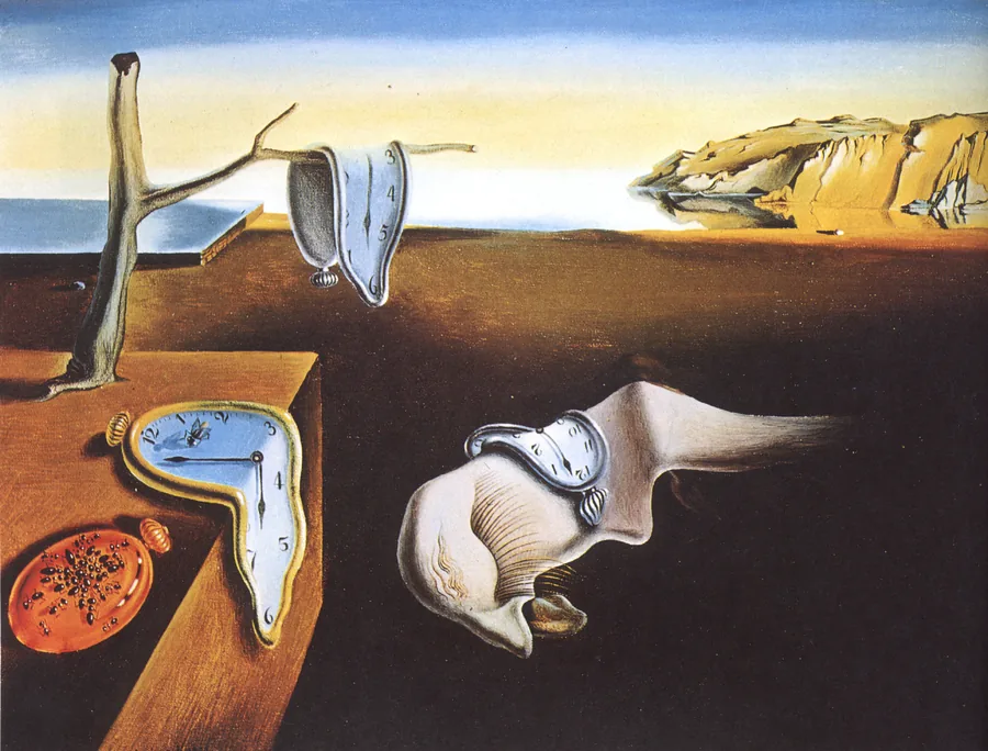
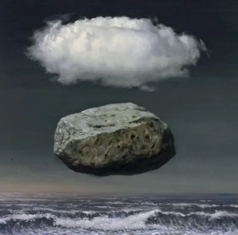
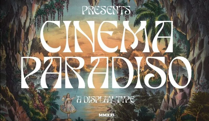
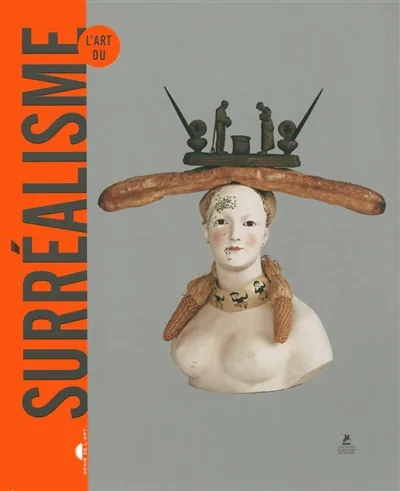
The references that grounded the direction before a single sketch: the paintings the brief was asking me to borrow a language from, plus the type references that would keep the result feeling like cinema, not a gallery wall.
Typography & Color
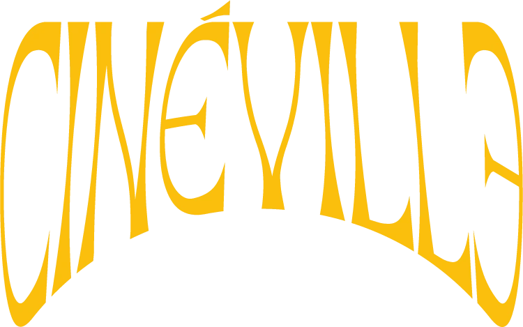
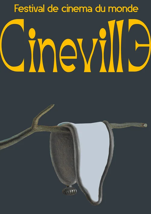
The display font behind the arched "CinéVille" wordmark above brings originality and a chic touch through its distinctive serifs. Everything else — dates, baseline, fine print — runs on a clean, modern sans that stays out of the way and keeps the poster legible.
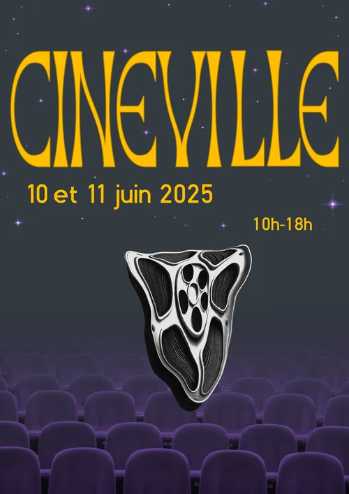
The palette pairs deep midnight navy with vibrant violet and warm gold, plus a soft cloud white: mystery and nighttime elegance, built for a festival, not a funeral.
From Sketch to Screen
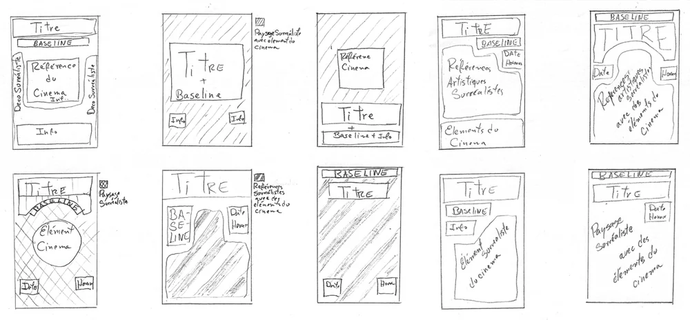
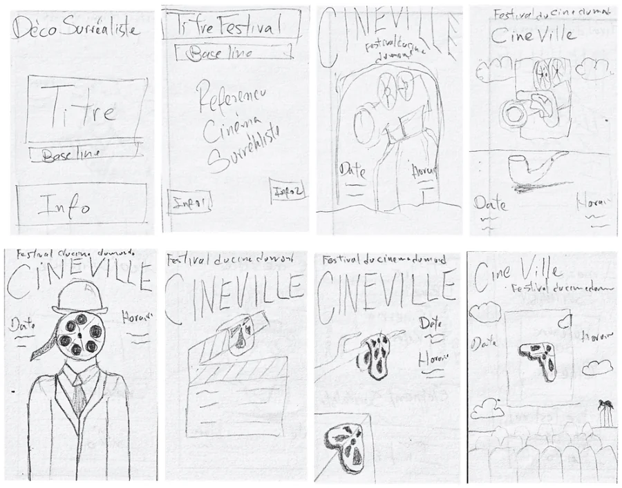
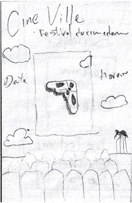
Ten thumbnail layouts, one bowler-hat-with-a-film-reel-for-a-head figure that didn't make the cut, and a single pencil drawing that basically predicted the final poster. This is usually the part that never makes it into a portfolio, so here it is, unfiltered.
The Poster
Everything above exists to earn this image: a film reel losing its shape over a cloud, floating above an audience that hasn't arrived yet. Built to scale from a bus shelter to a city billboard, and to stay legible either way.

The References
Two surrealist tropes, remixed into one image that tells the story of watching a film:
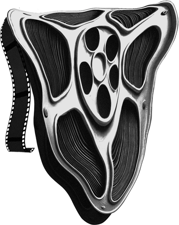
The Melting Reel
A direct nod to Dalí's The Persistence of Memory. On the poster, it stands for the audacity of international cinema: its ability to question how we normally perceive time and reality.
The Dreamscape
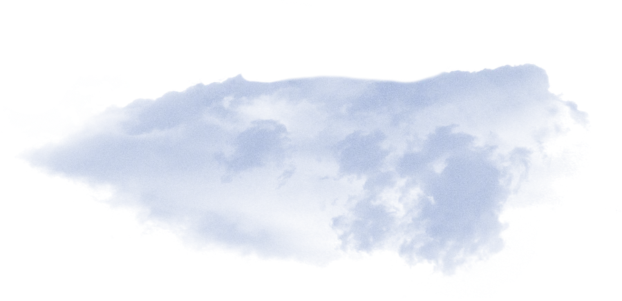
Magritte's clouds chase something intangible: dreams placed where you don't expect them, standing in for the ephemeral and the mysterious. On the poster, the cloud represents imagination and creativity.
Urban Application
The poster was designed to be scalable, maintaining its impact whether on a small bus shelter or a large city billboard.


