.webp)
The Problem: Low Engagement
The original Spin app was functional but faced two key business challenges:
- Low Engagement: Users started by spinning the rewards before performing top-ups, which in many cases discouraged them from continuing with the transaction. .
- Outdated UI: An inconsistent and visually outdated interface created a high learning curve, resulting in a disconnected user experience.
The goal was clear: Redesign the experience to make rewards an integral and exciting part of the user flow, not an afterthought.
My Process: From Flow to Fun
1 — Redefining the User Flow
I started by mapping the entire user journey to identify friction points. The original flow was fragmented. I restructured it to create a seamless loop: Top-Up → Reward → Engagement. Using Yu-Kai Chou’s Octalysis Framework, I focused on core drivers like "Accomplishment" and "Unpredictability" to make the rewards feel more earned and exciting.
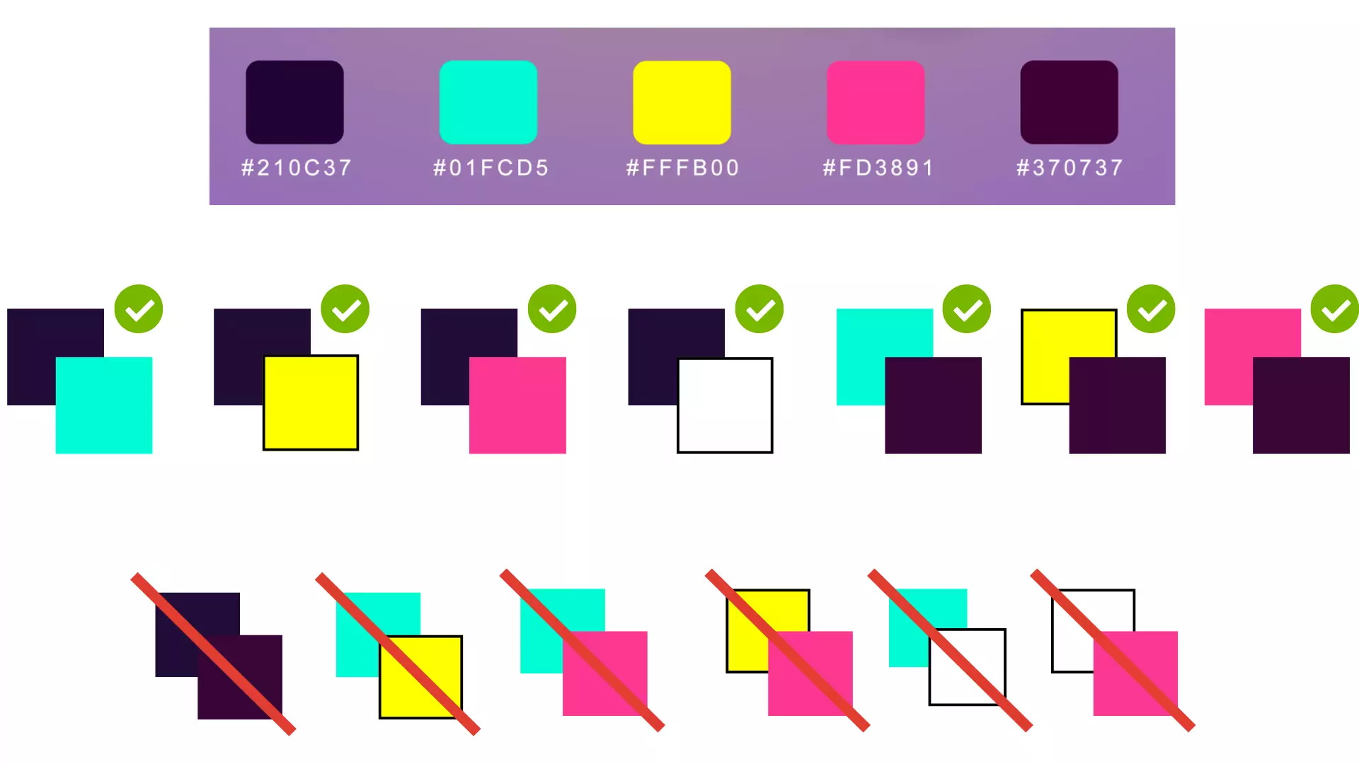
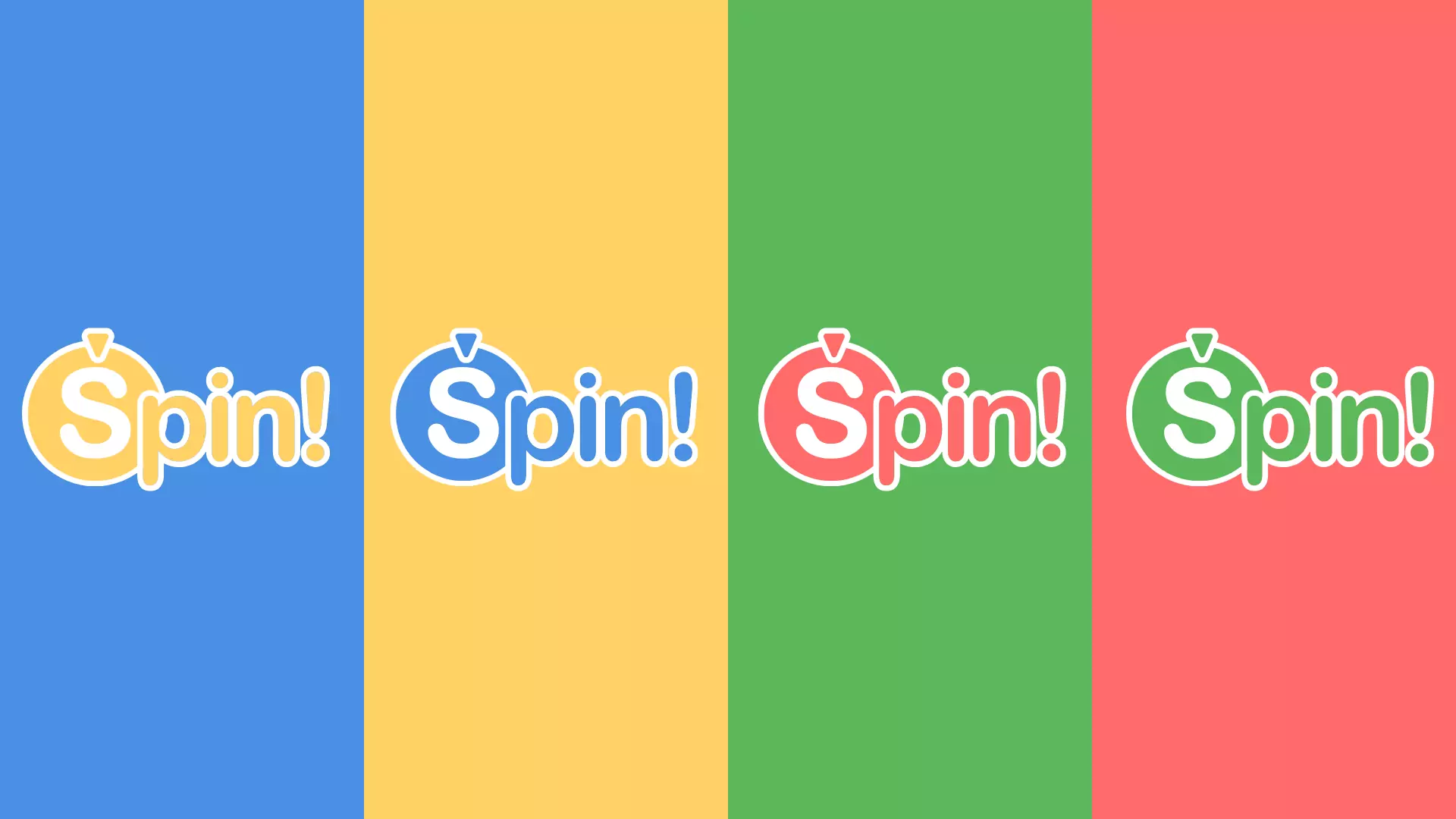
2 — A Fresh Visual Identity
To blend trust with playfulness, the visual identity was refreshed. This involved creating a more dynamic logo and a balanced, game-inspired color palette that feels both modern and inviting.
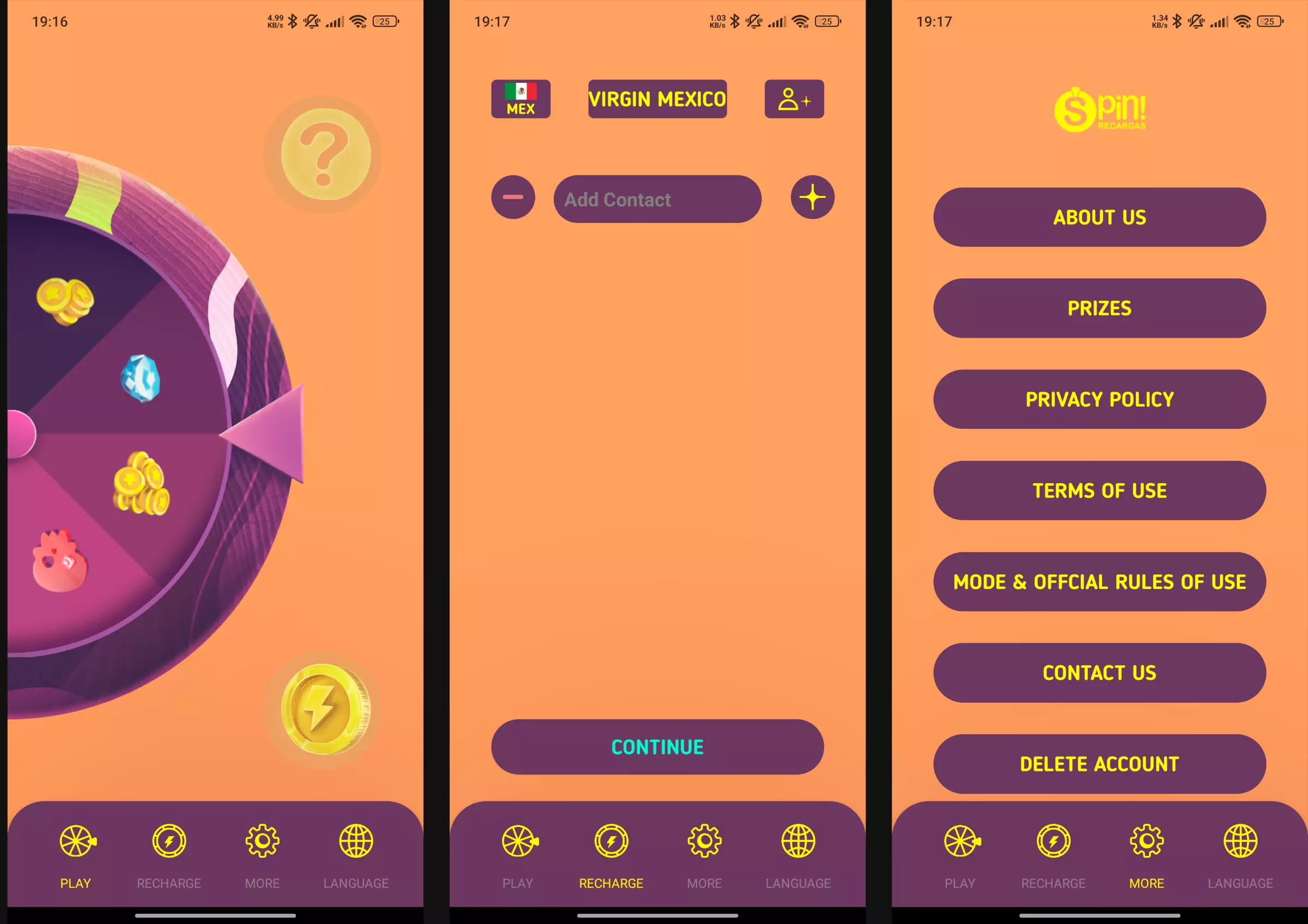
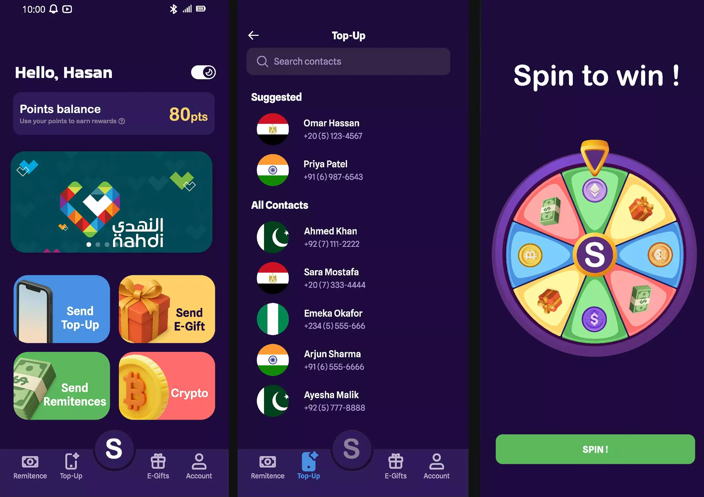
3 — UI Redesign & Microinteractions
The interface was redesigned for clarity and delight. While keeping navigation conventions for faster adoption, the idea is to introduce a cleaner layout and microinteractions (fluid animations, haptic feedback) to make every action feel responsive and rewarding.
Impact & Key Takeaways
While I don't have access to post-launch analytics, the redesign was focused on achieving key qualitative improvements:
- Improved Clarity: The new UI significantly reduces cognitive load, making the path to core actions and rewards intuitive and visible from the home screen.
- Increased Emotional Engagement: The shift from a purely transactional flow to a rewarding experience is designed to boost user satisfaction and retention.
- Key Learning: This project reinforced the importance of balancing business goals (engagement) with user needs (a fast, simple process). The solution was not to add more features, but to seamlessly integrate the existing ones into a more cohesive and enjoyable journey.
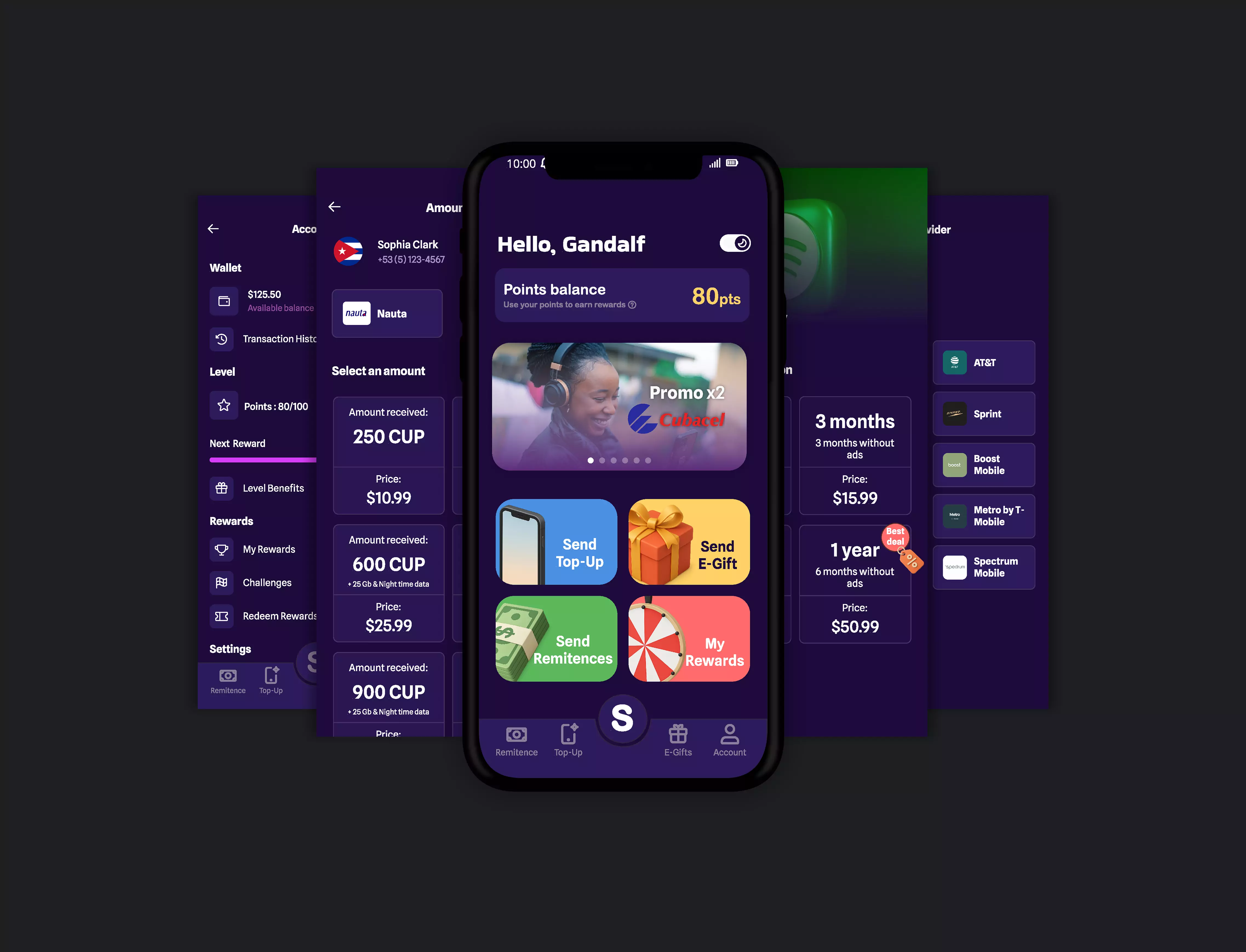
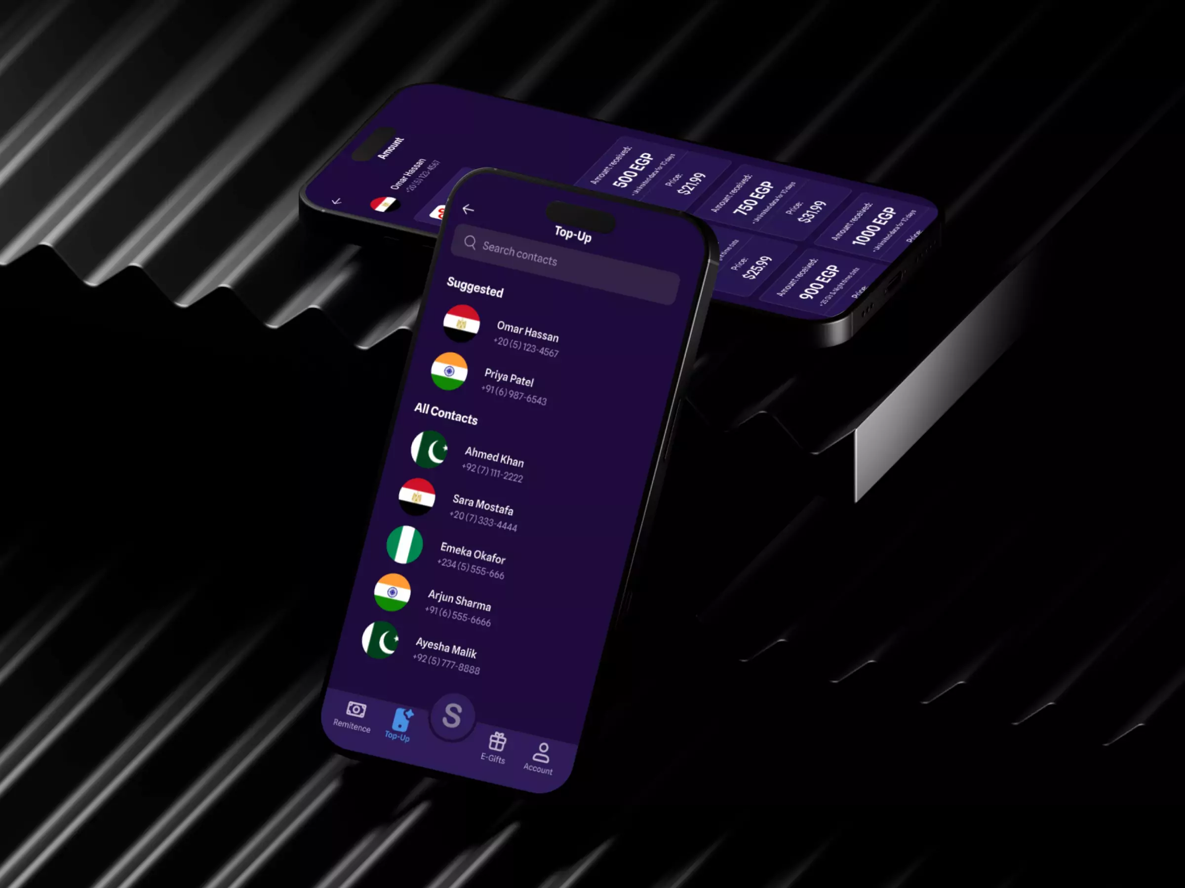
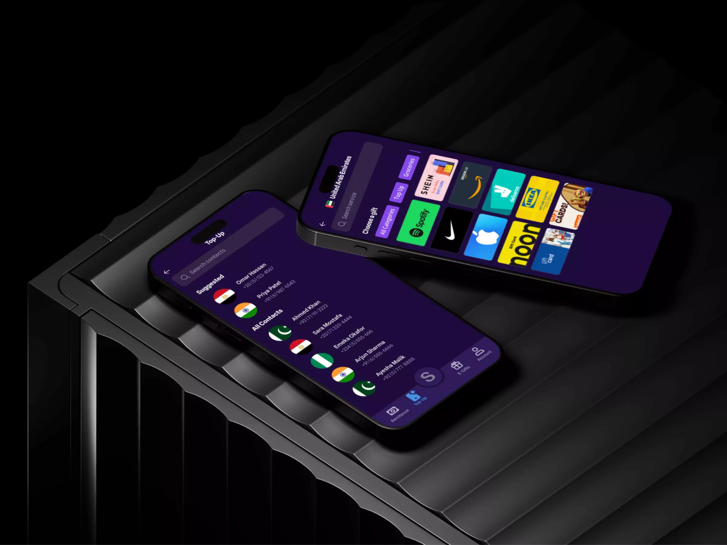
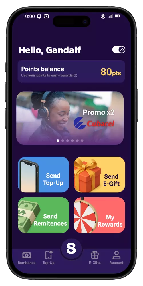
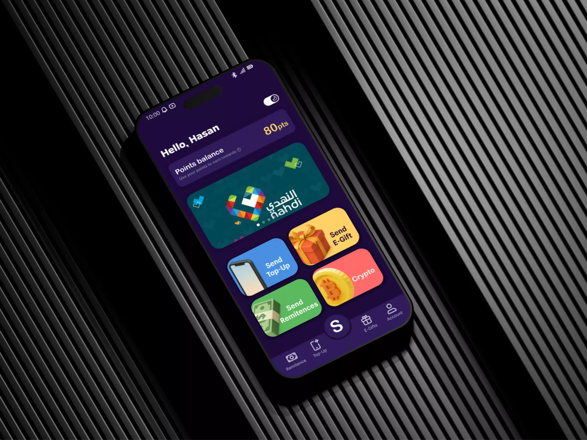
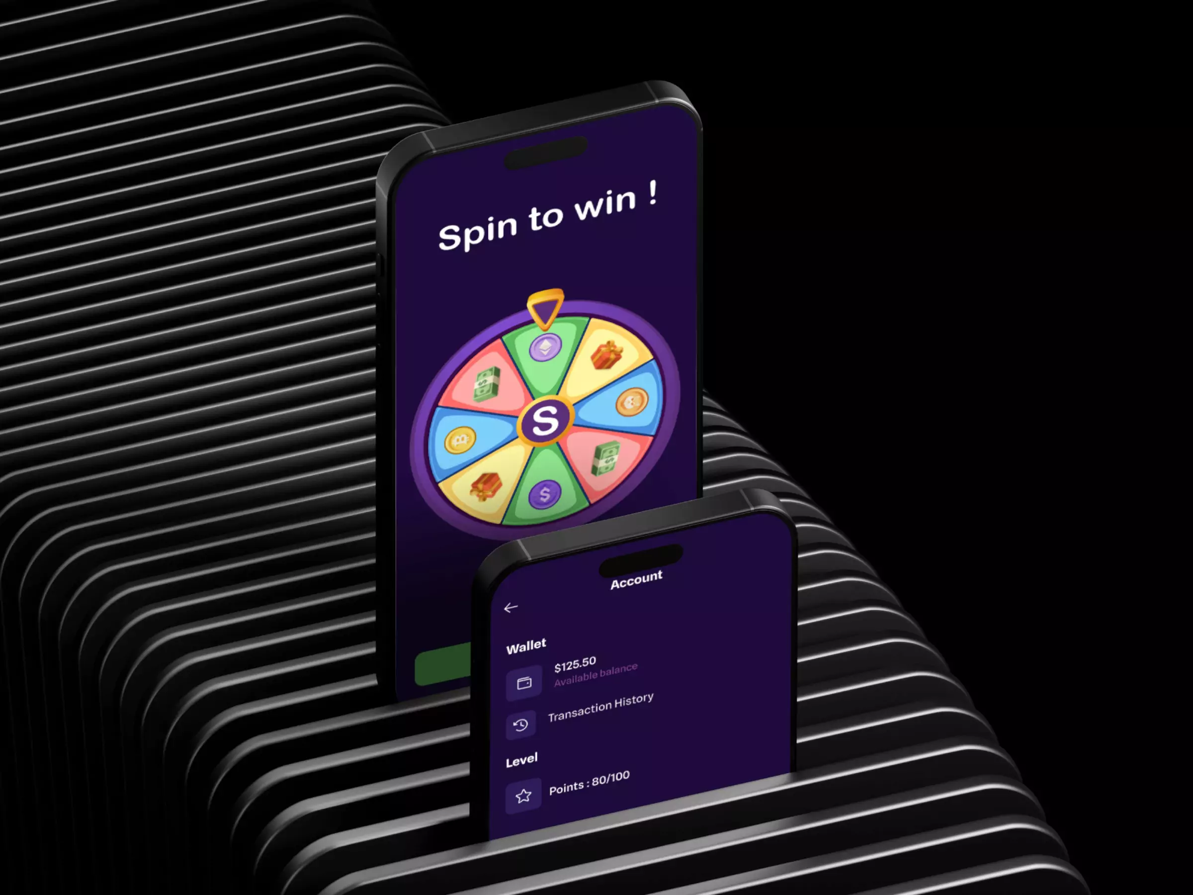
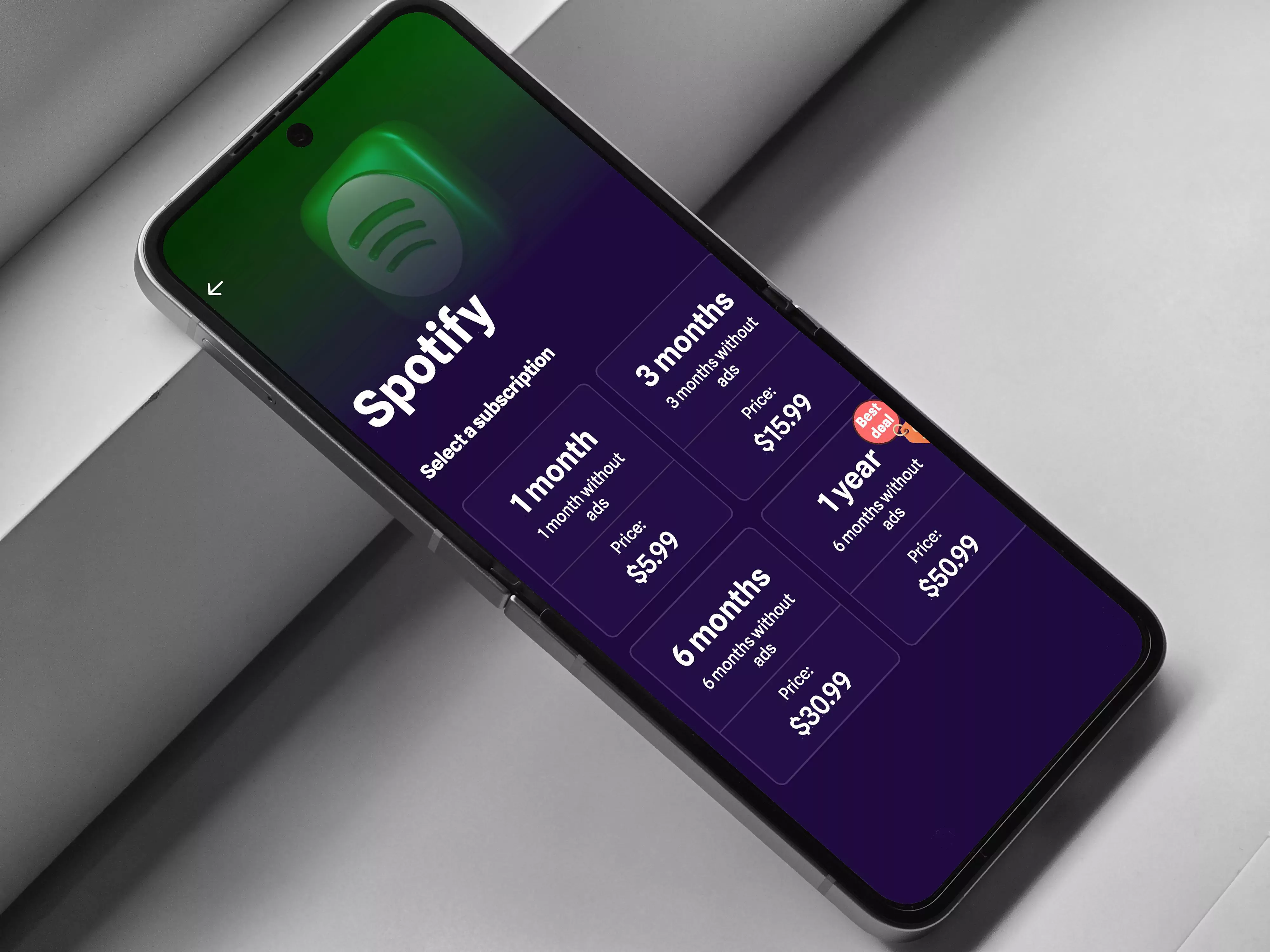
Project Gallery
Below are some selected screens and visuals from the redesign process, including a short video demonstrating the intended microinteractions.