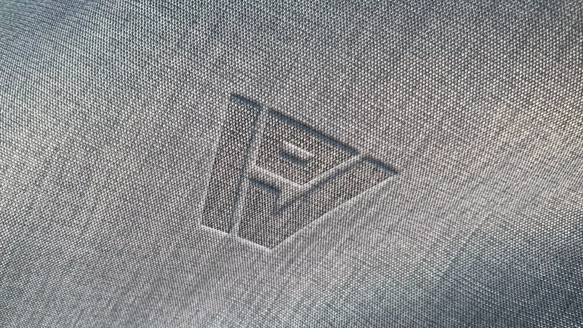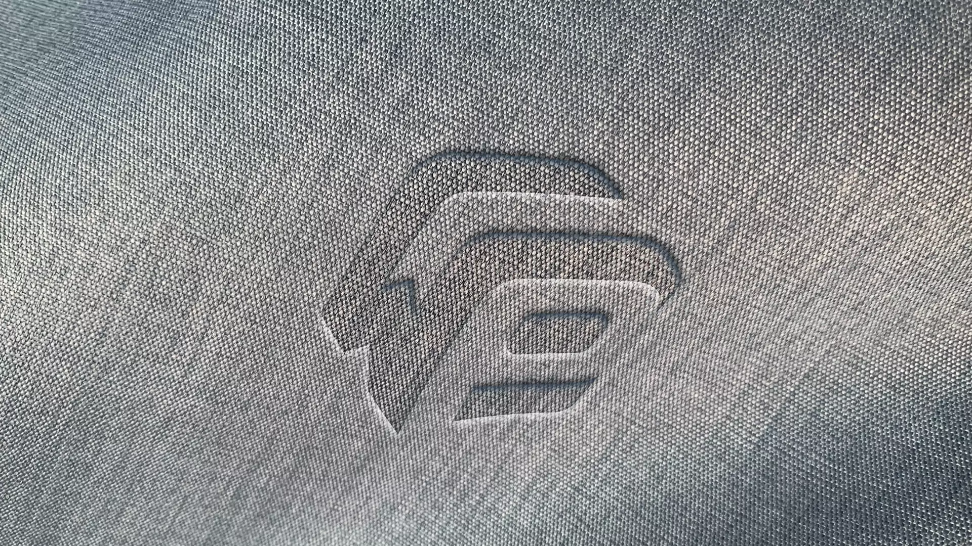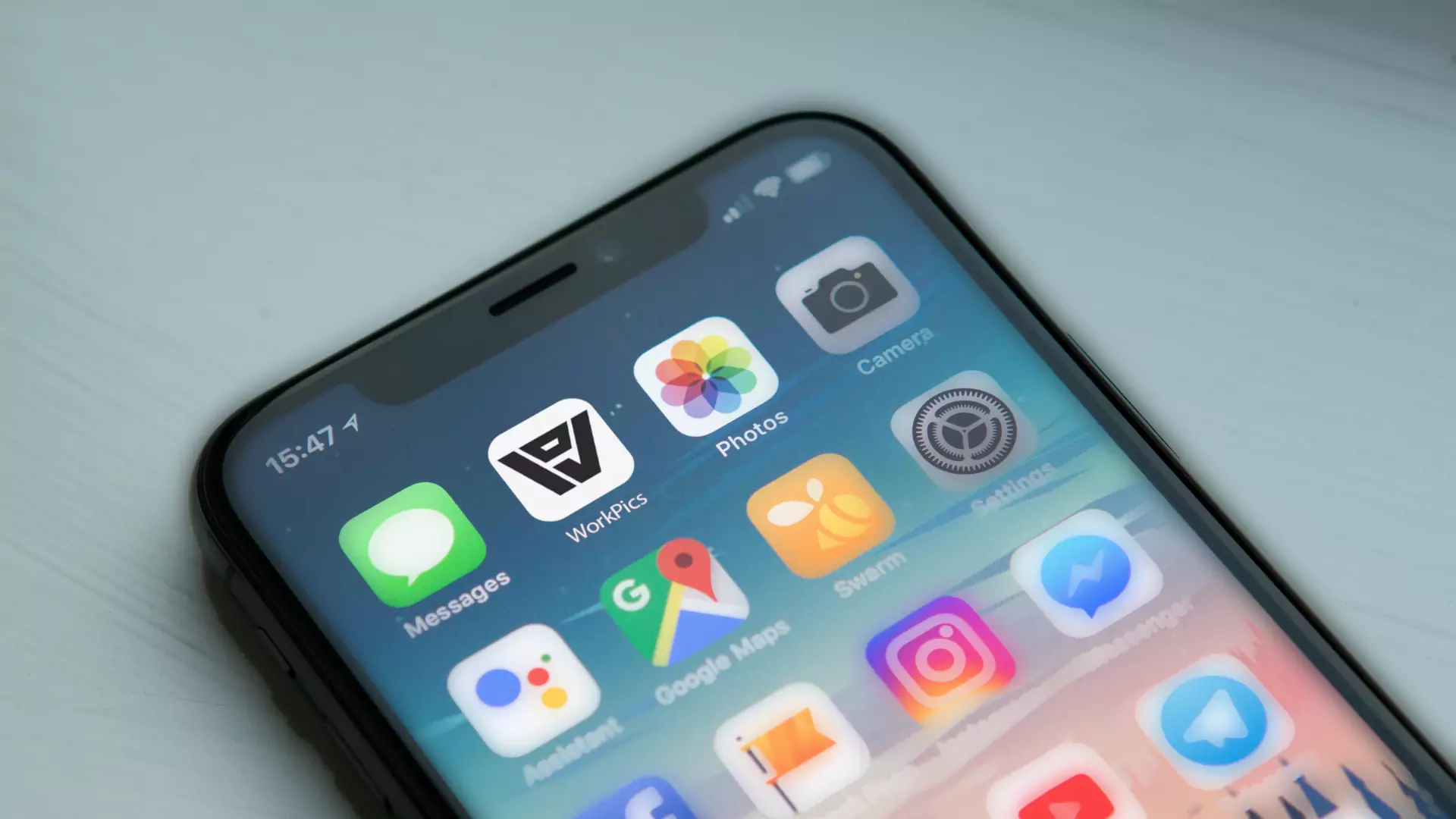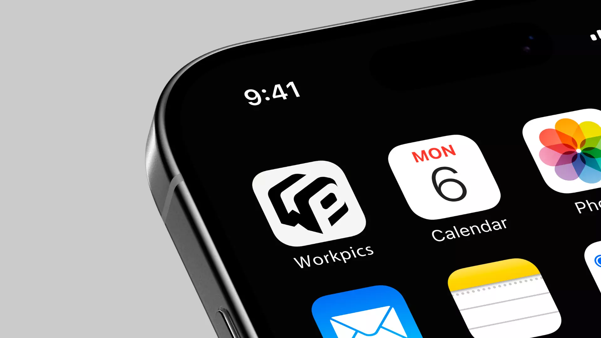
The Result
WorkPics is published on Google Play. It is a field photo reporting app for construction teams, built by a developer friend.
My friend asked me for help with the design. I designed the logo and the interface screens. This was an informal collaboration, not a client commission.
My link to the Google Play release is as a tester. Google requires twelve testers before an app can leave closed testing. I was one of them.
The Screens
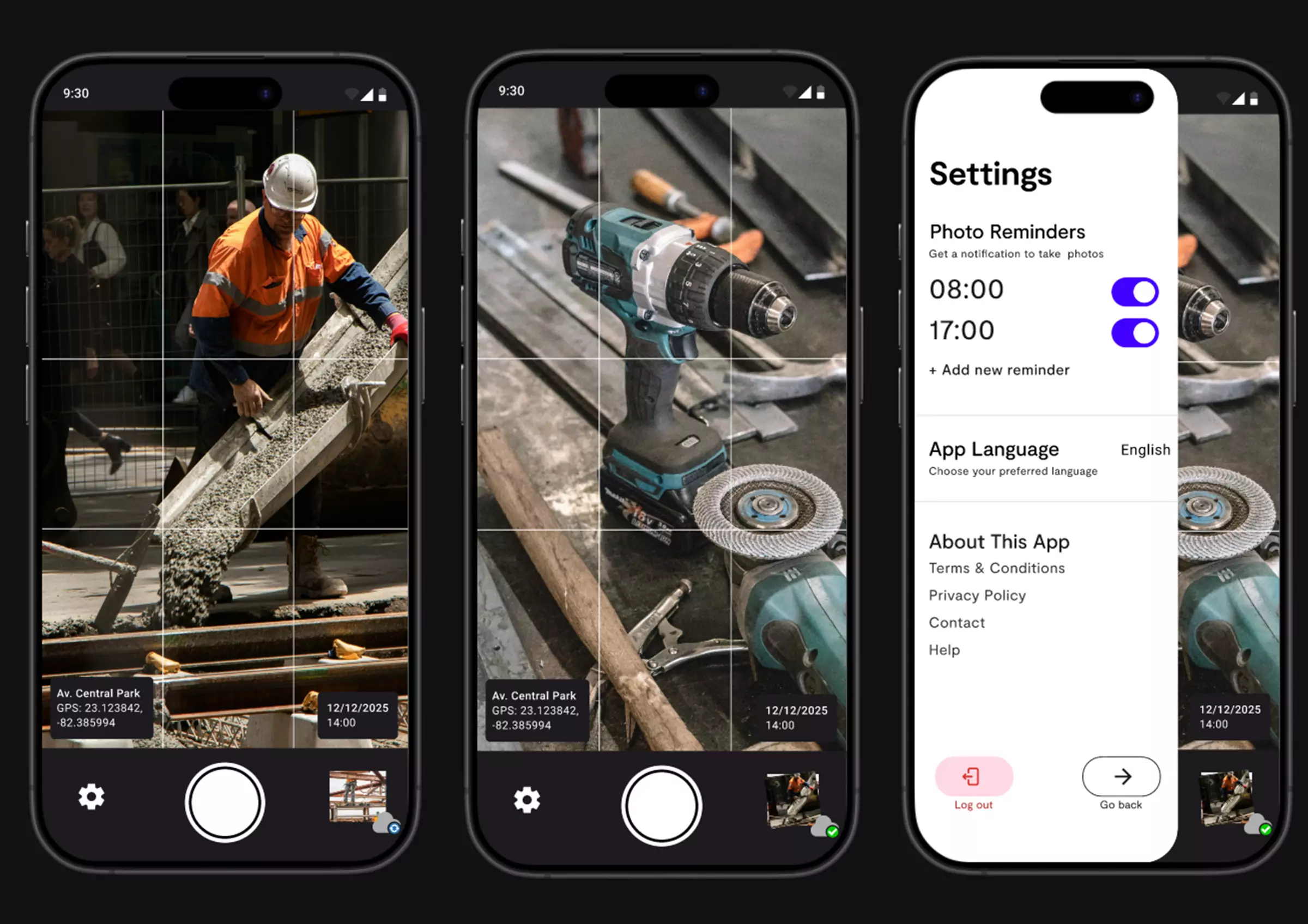
The users are construction workers. They wear gloves and work in bright sunlight. I kept the screens to the minimum: "Open → Shoot → Done".
1 - Sketching the Flow
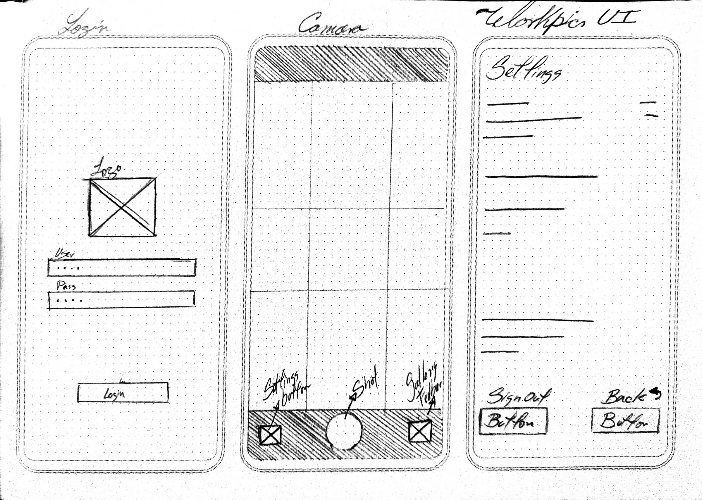
I sketched the layout on paper first and removed every non-essential element. Location, time, and user ID are captured in the background. The user only frames the shot.
Interface Choices
- Login & Forget: Workers log in once. The app remembers their session and assigned site.
- Camera First: The interface mimics standard native cameras to reduce the learning curve to zero.
- Oversized Controls: Buttons are large and spaced out to prevent miss-clicks with gloves.
2 - High Contrast Screens
I built a clickable prototype in Figma. The screens use strong contrast so they stay readable outdoors. A green check confirms each upload, so the worker does not need to read any text.
Try Figma Prototype →3 - Color Palette
The palette borrows from safety gear: high-vis orange and signal green. A deep blue balances them.
Color Palette
#F5F5F5
Clarity
#4300FF
Trust
#08CB00
Success
#FF6600
Alert/Action
4 - Logo: The Placeholder Won
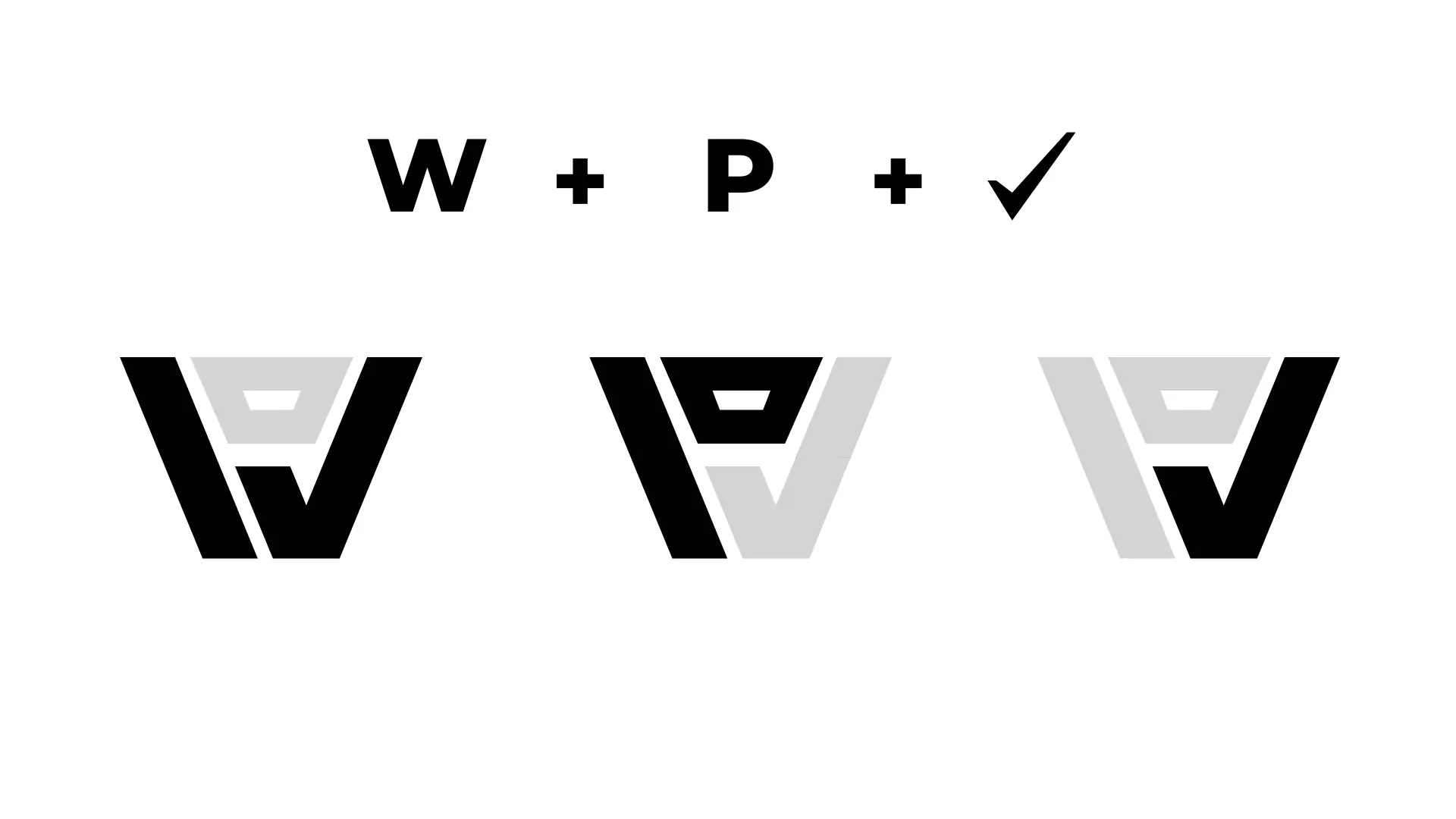
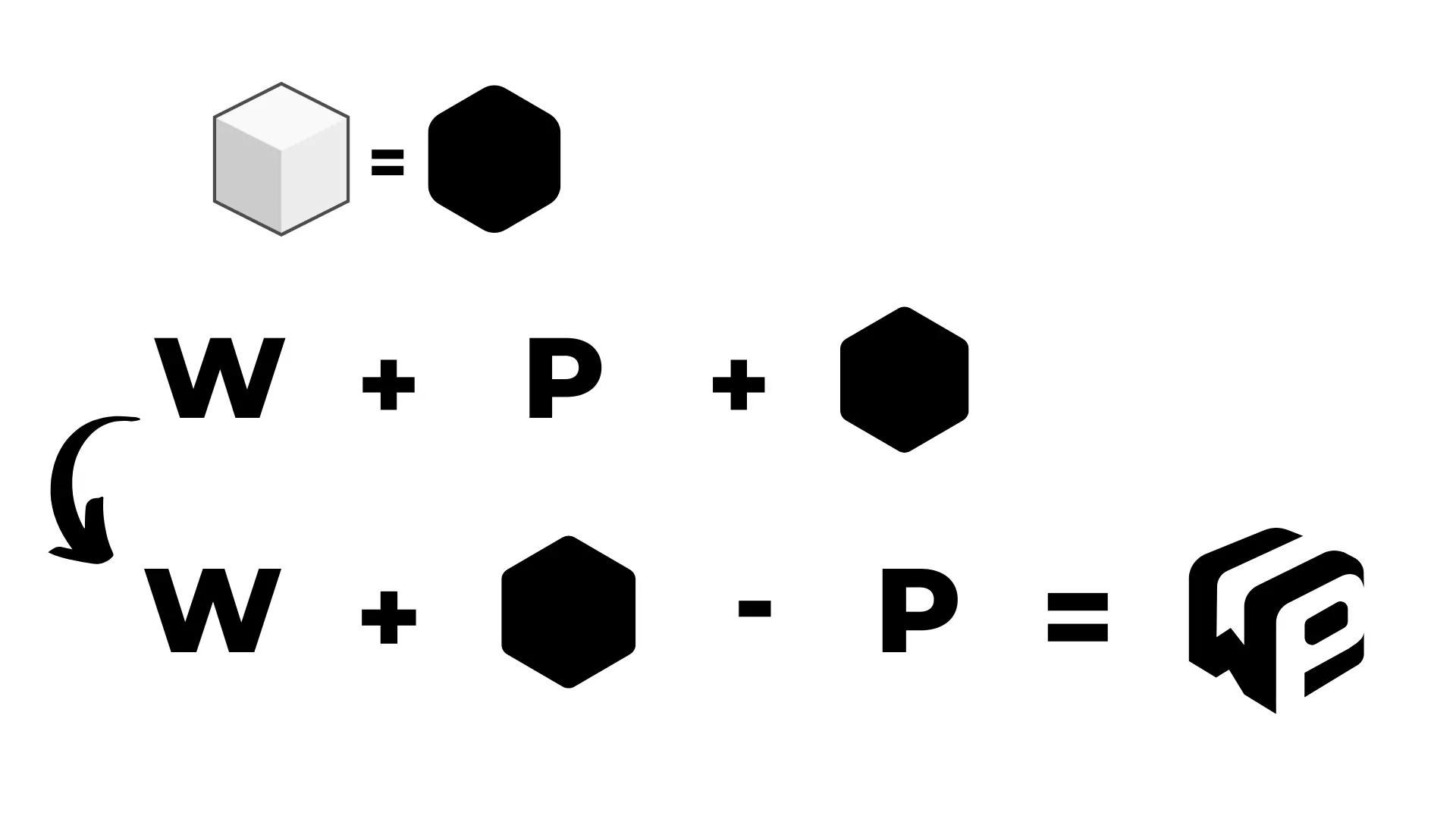
I made several logo proposals, each based on research into a different visual idea for the app. The team chose none of them. They picked a placeholder I had made in five minutes.
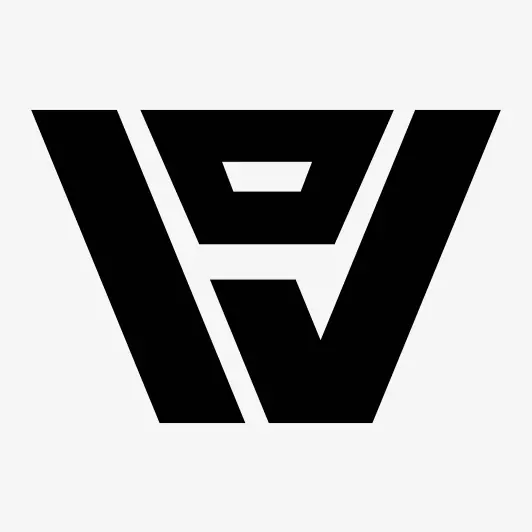
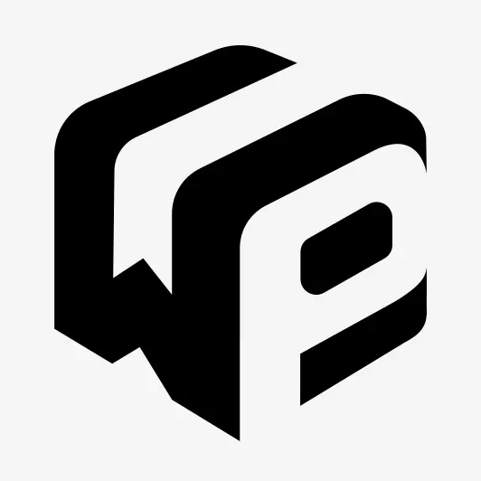
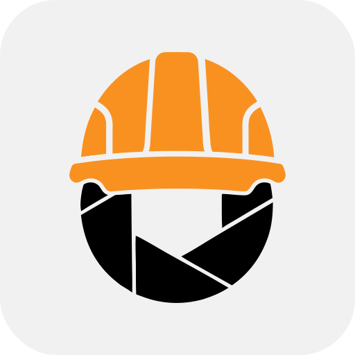
The lesson: a simple mark that already works can beat a polished exploration.
Project Gallery
Mockups of the screens and the logo in use.